Eazzy Pizzy Pizza Delivery
About
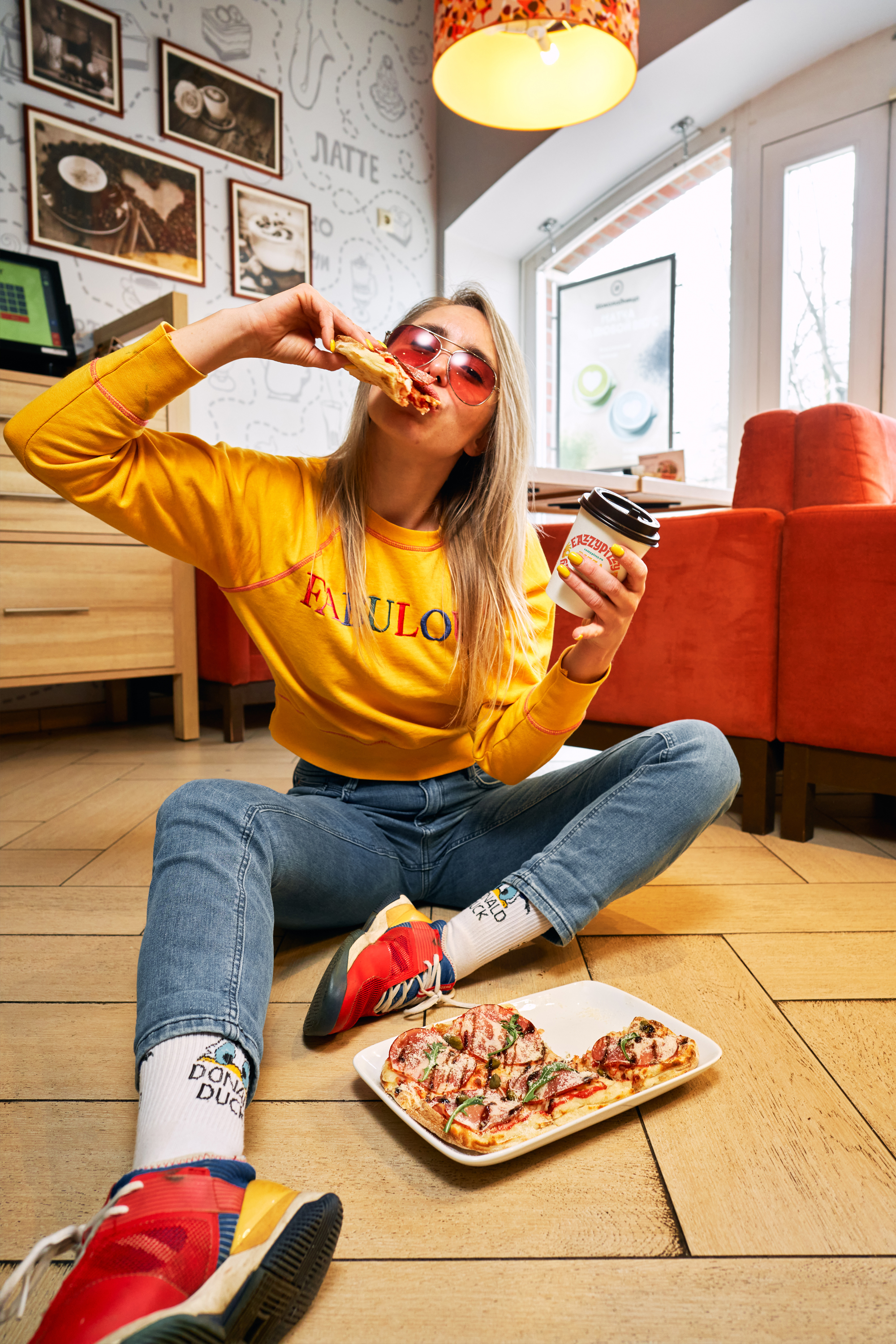
Eazzy Pizzy is a delivery company specializing in pizza, gelato, drinks, and other foods, part of the famous Shokoladnitsa coffee shop chain. The menu boasts over 30 types of pizza, a wide variety of gelato, soups, salads, pasta, several snack options, and numerous beverages, including house-made lemonades, fruit drinks, lattes, americanos, and cappuccinos. A hallmark of the brand is its exceptional diversity and fusion of flavors in its offerings: sweet, salty, sour, and bitter. Innovative culinary combinations, utilized in varying proportions, challenge and expand our traditional perceptions of taste. This product line caters to gourmets who value unique food experiences, are receptive to novel ideas, and are eager to explore and experiment.
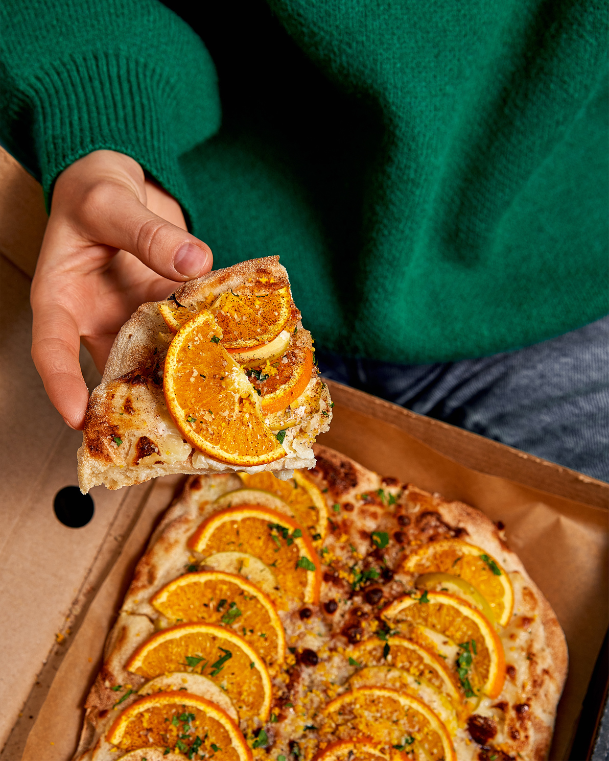
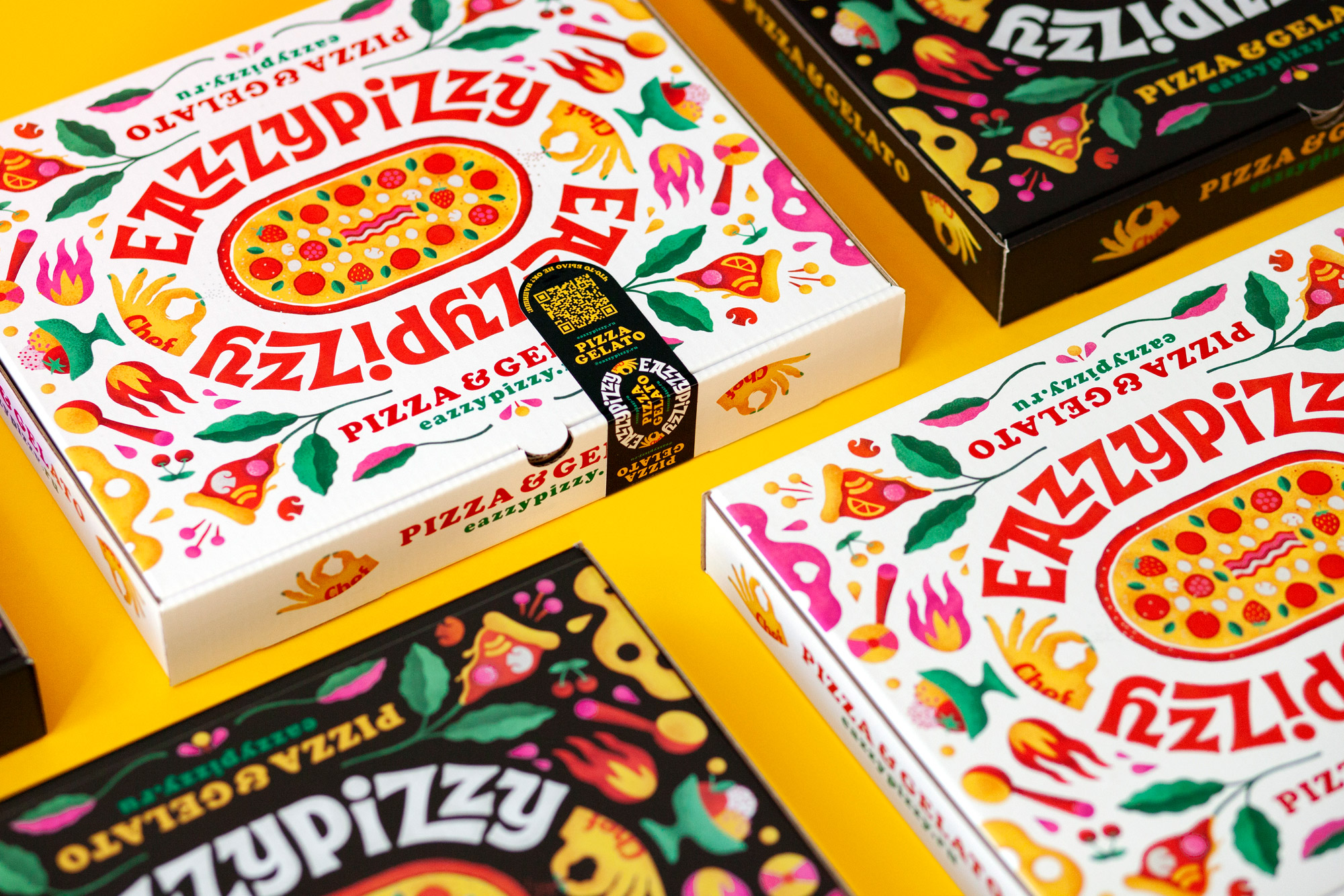
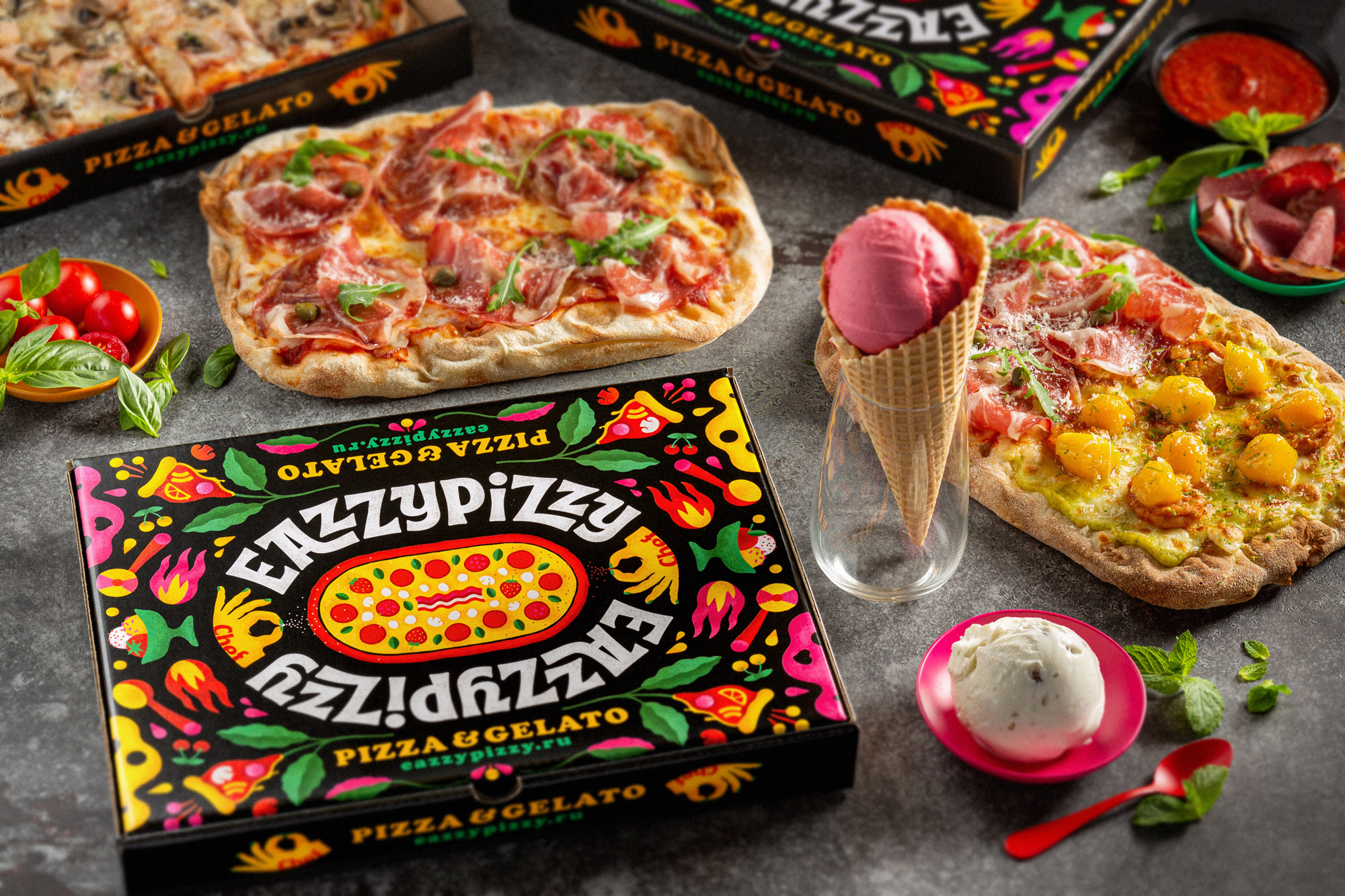
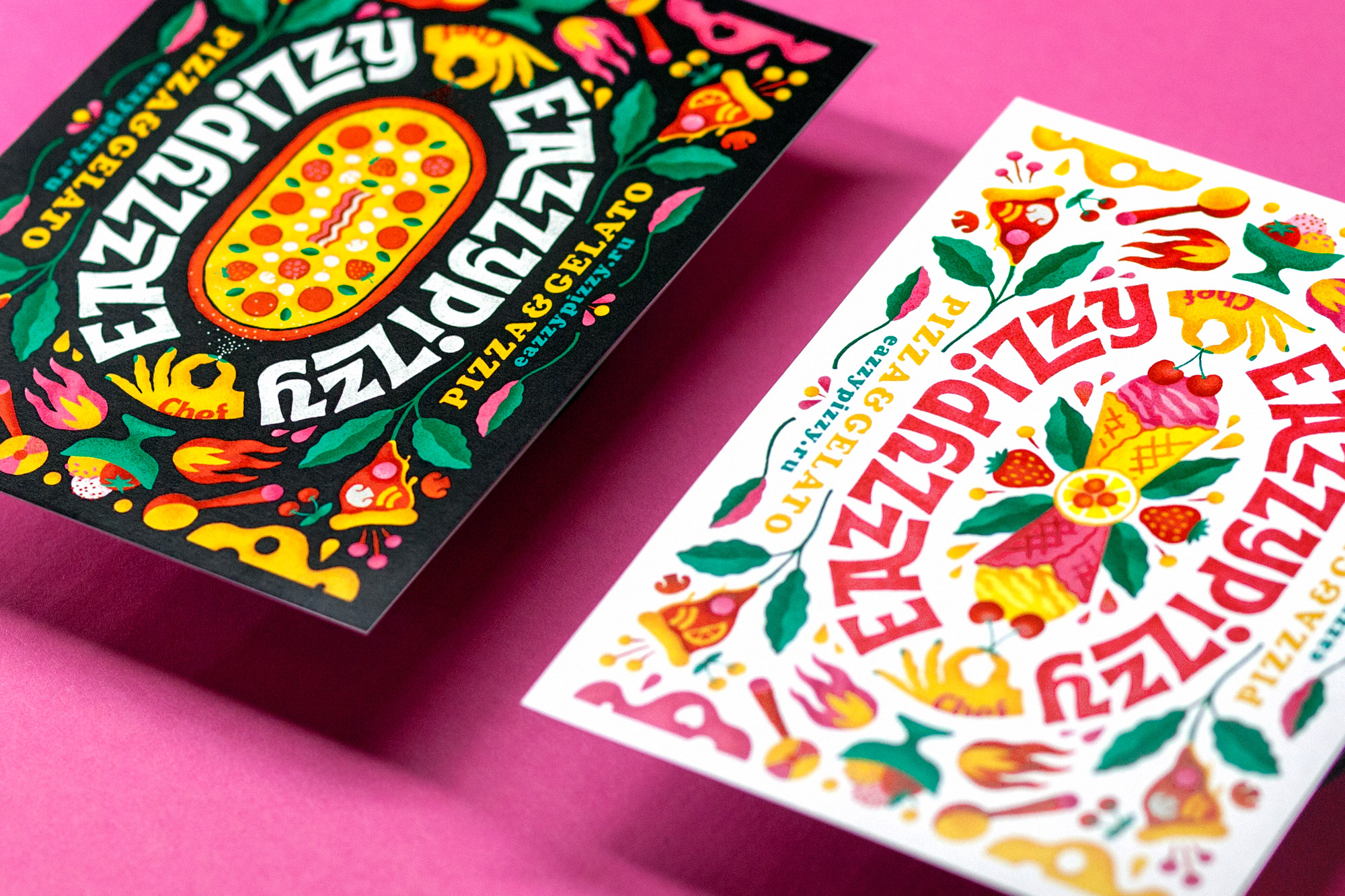
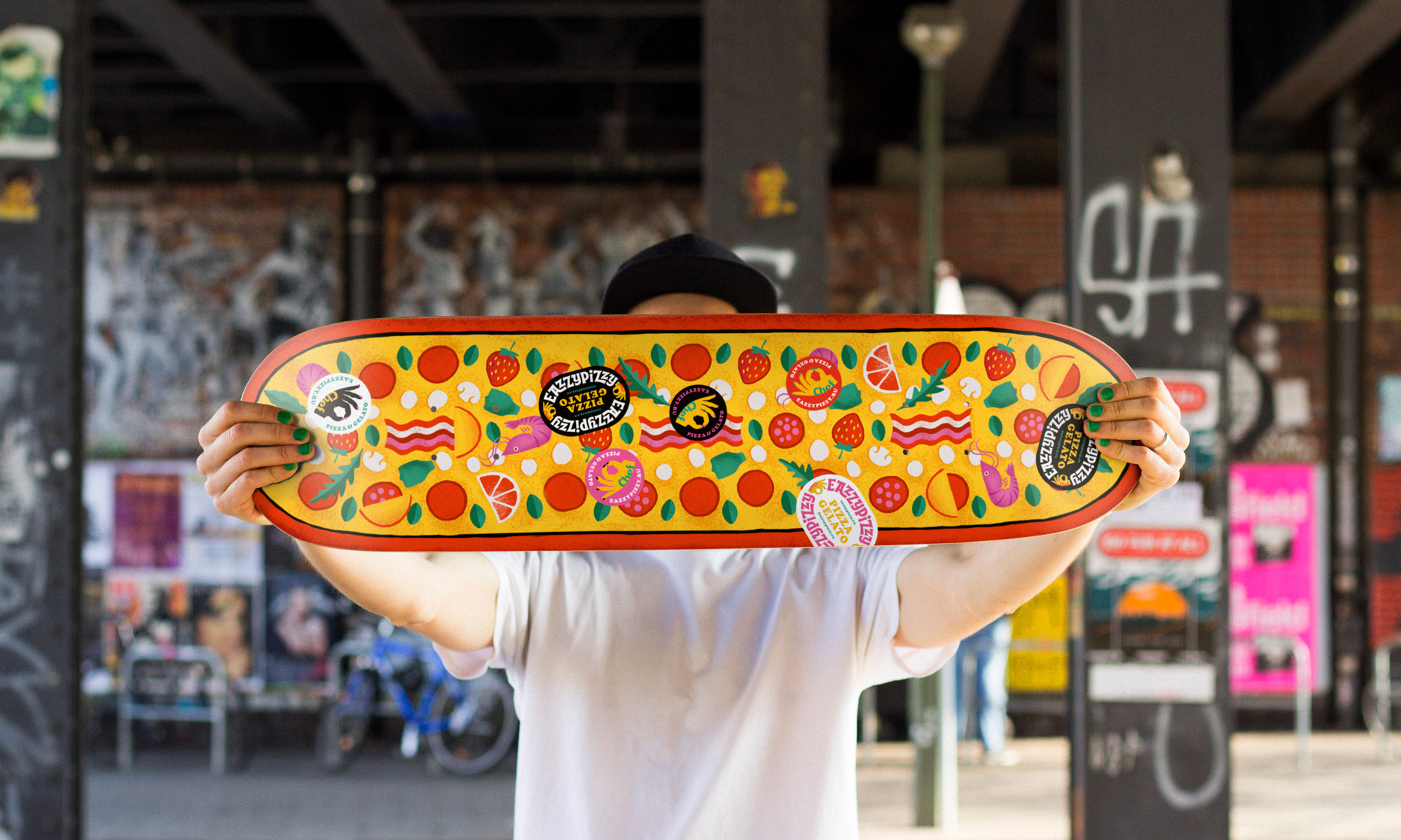
The unique essence of Eazzy Pizzy is encapsulated in its vast array of taste combinations. In designing the brand identity, we employed a visual strategy of contrast to highlight the brand's distinctiveness. The branded pattern includes a slice of pizza adorned with an orange, scoops of ice cream paired with tomato, melted cheese with sweet cream, strawberries, and a hint of salt.
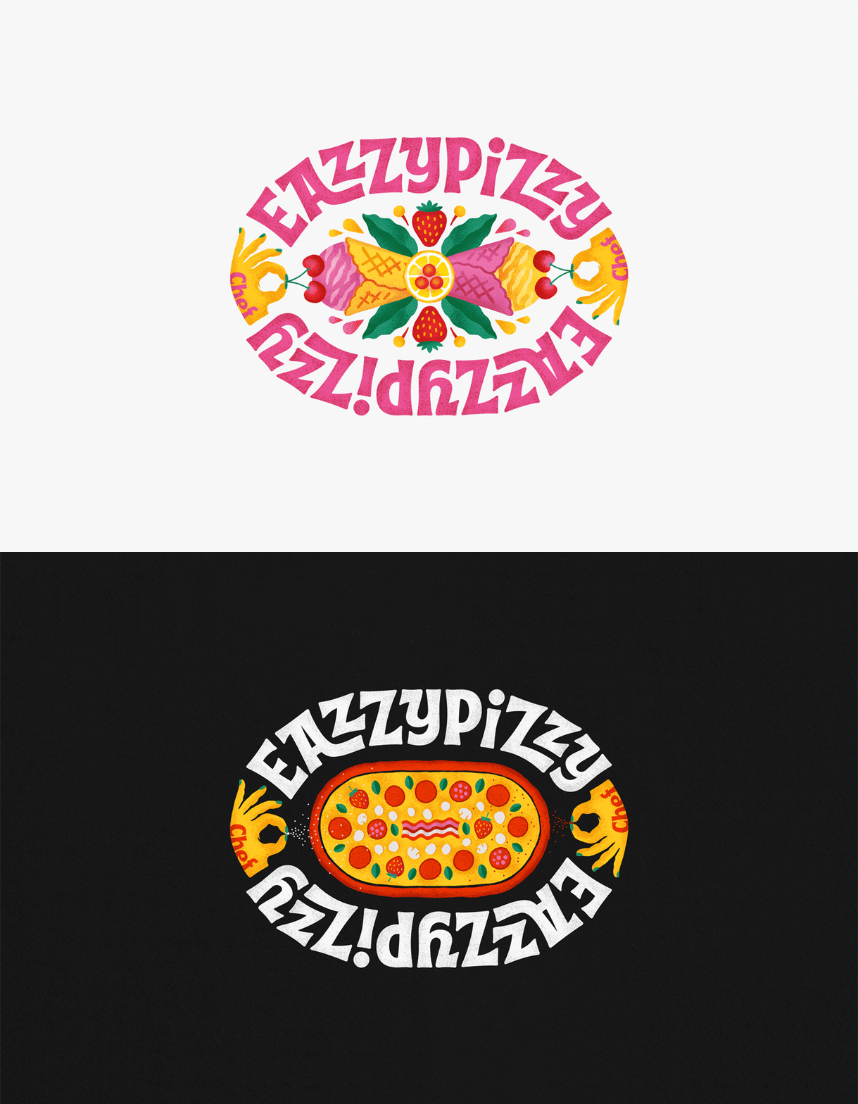
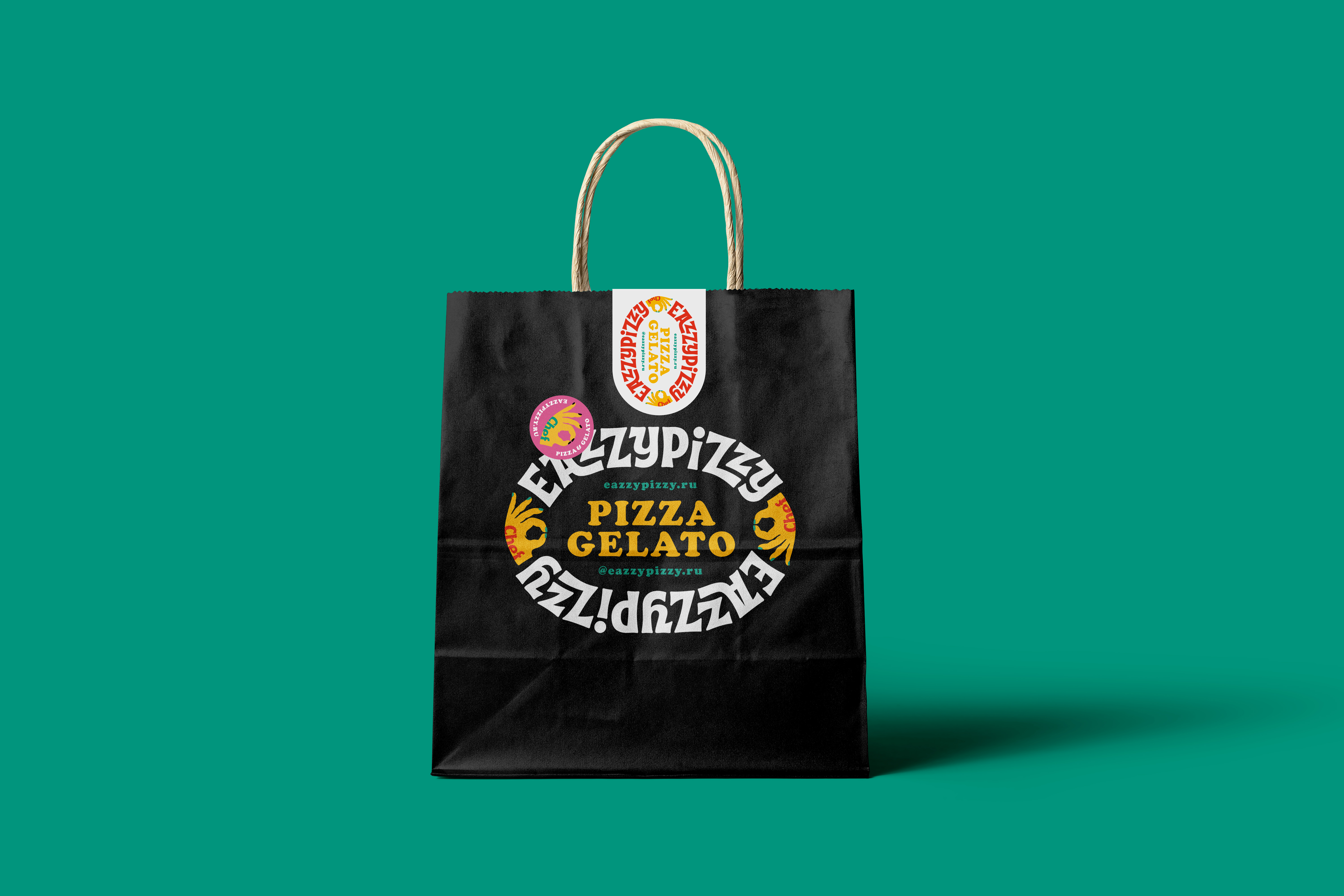
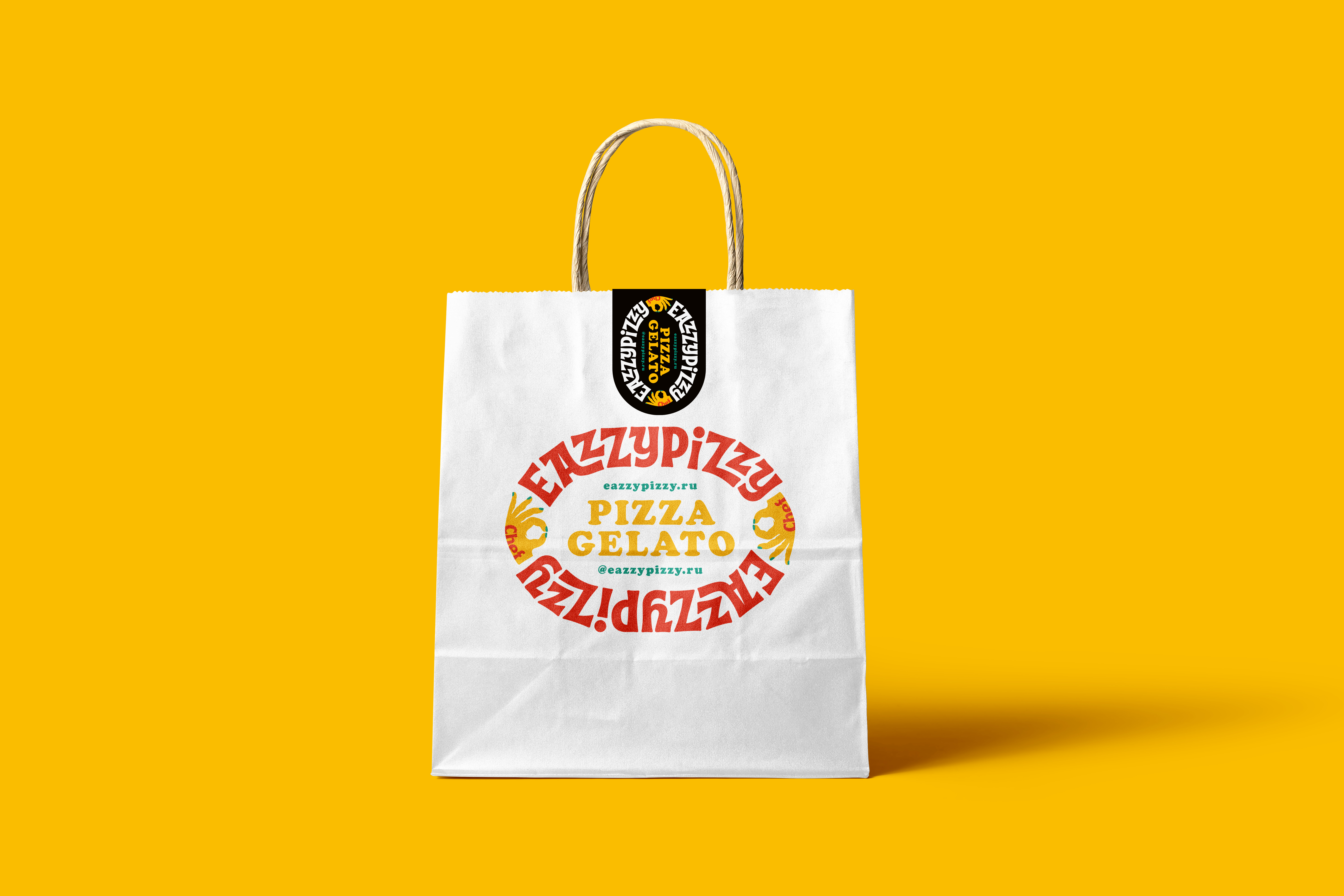
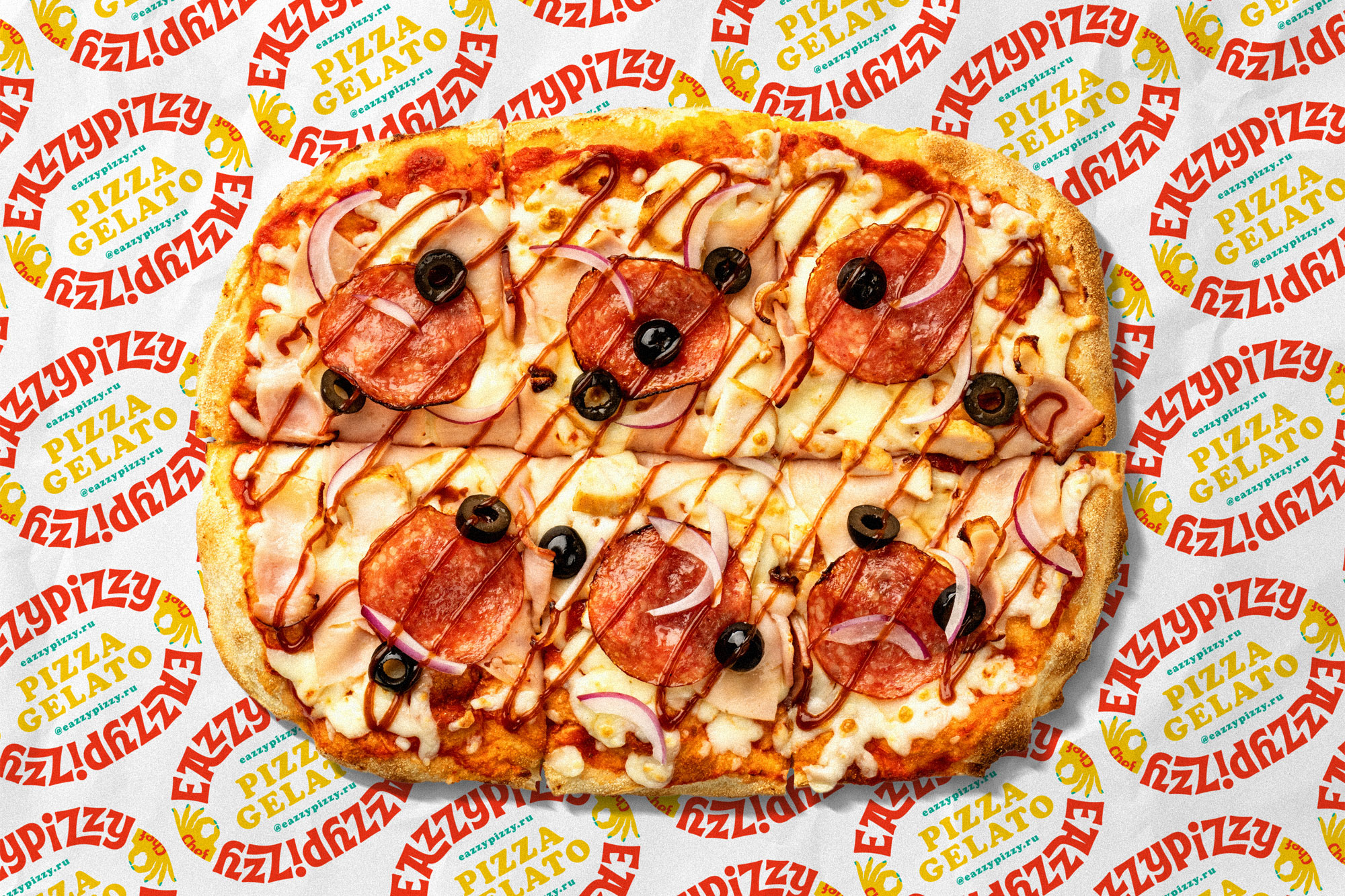
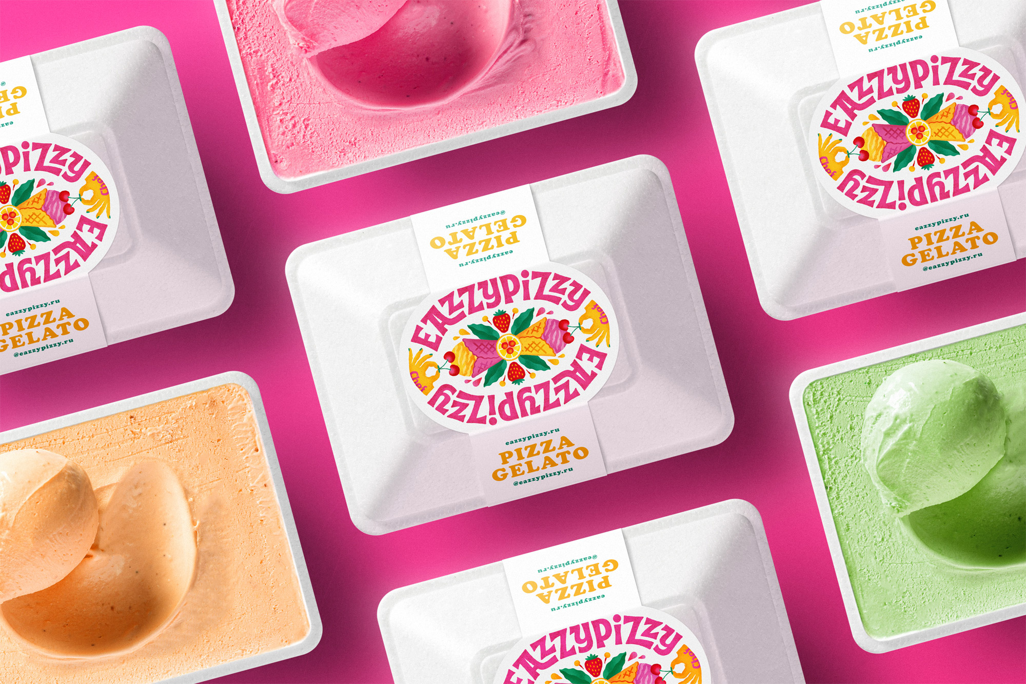
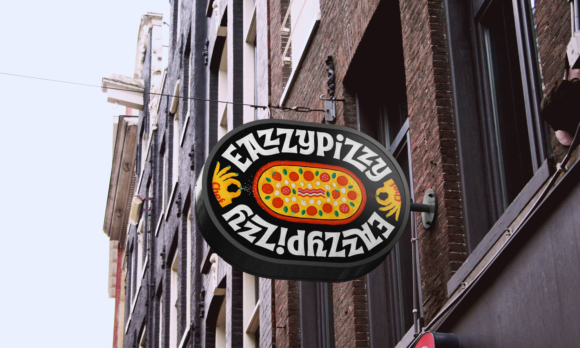
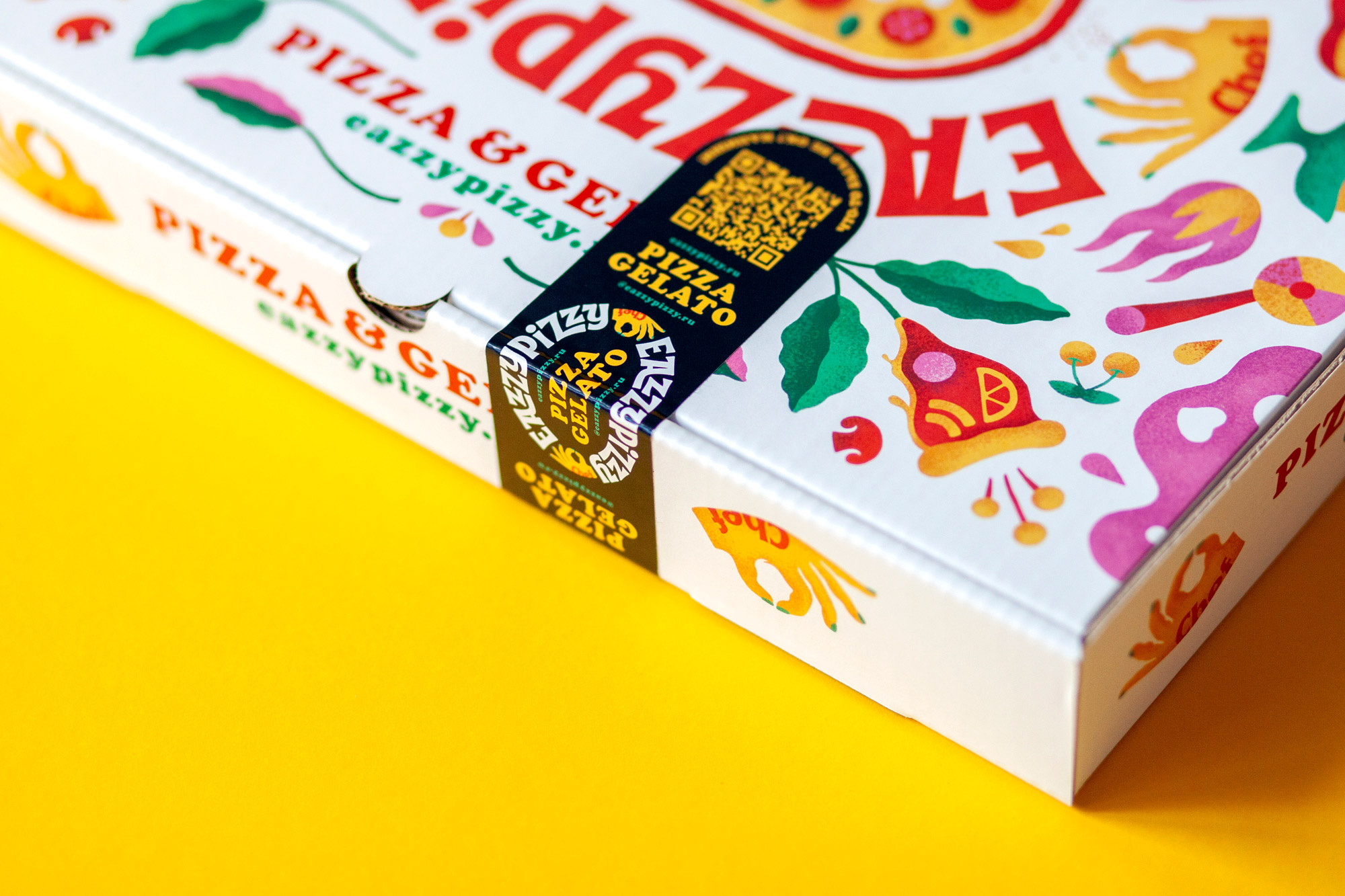
To encapsulate the breadth of flavors, we created two logo variants: one for pizza and another for gelato. Additionally, we have a simplified font version of the logo for use on wrapping paper, branded bags, and other merchandise. The "stadium"-shaped elongated logo mirrors the traditional elongated shape of pizzas. This design ensures the logo's visibility from all angles, with the pizza at its heart acting as a focal point, while the surrounding font mimics a group of individuals gathered around a pizza, anticipating a delicious meal. The Eazzy Pizzy lettering introduces an element of Italian classic design through its repeating patterns. The orderly alignment of letters, devoid of sharp edges and flowing in a smooth clockwise direction, forms a symmetrical arrangement and a distinctive, recognizable image.
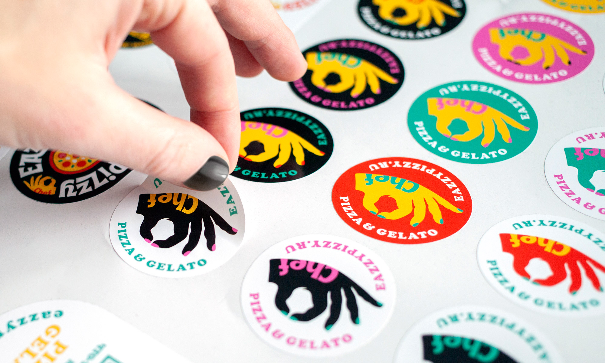
The chef's hands, illustrated as sprinkling spices onto the pizza and adding cherries to the gelato in the second logo version, enhance the emblem's appeal. These hands also mimic the culinary "OK" gesture.
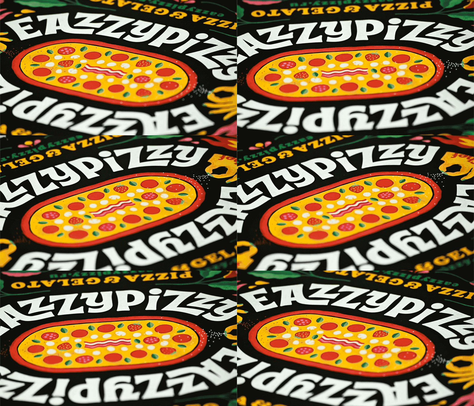
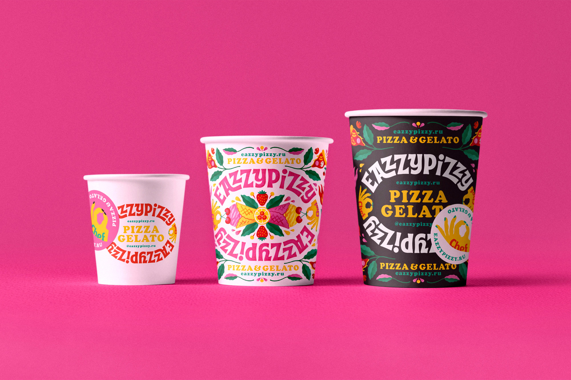
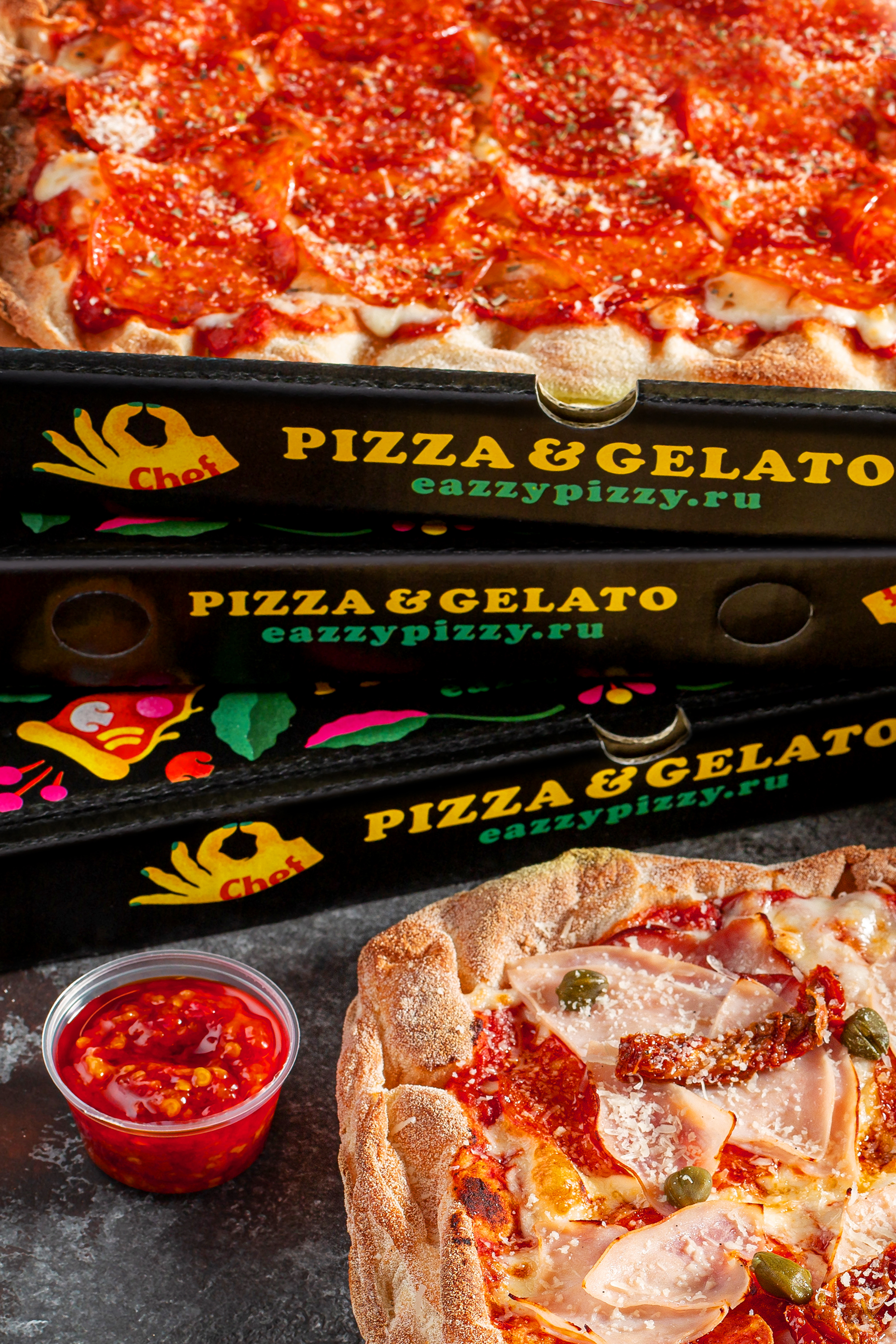
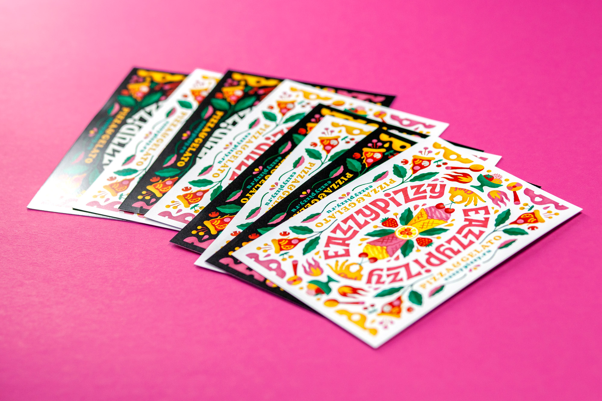
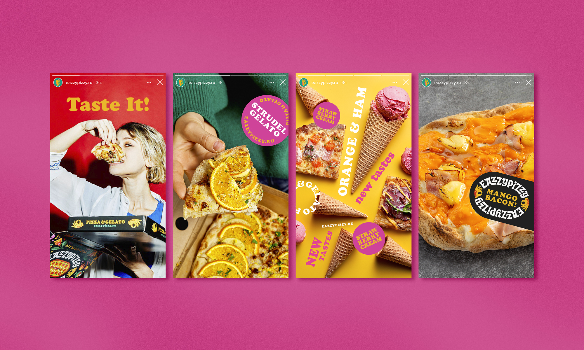
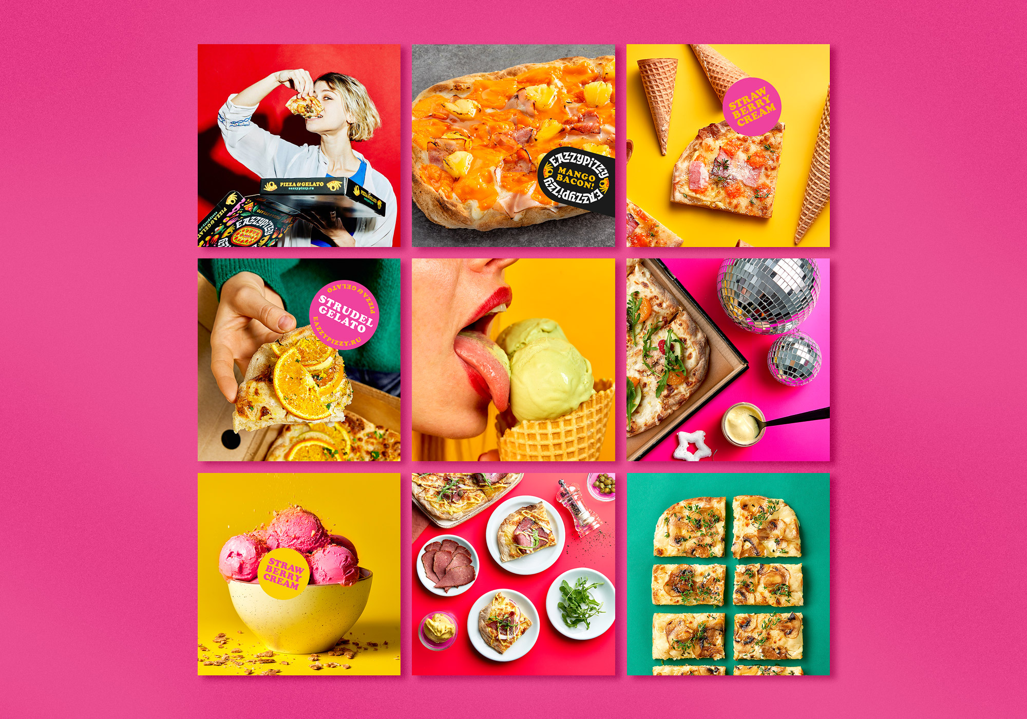
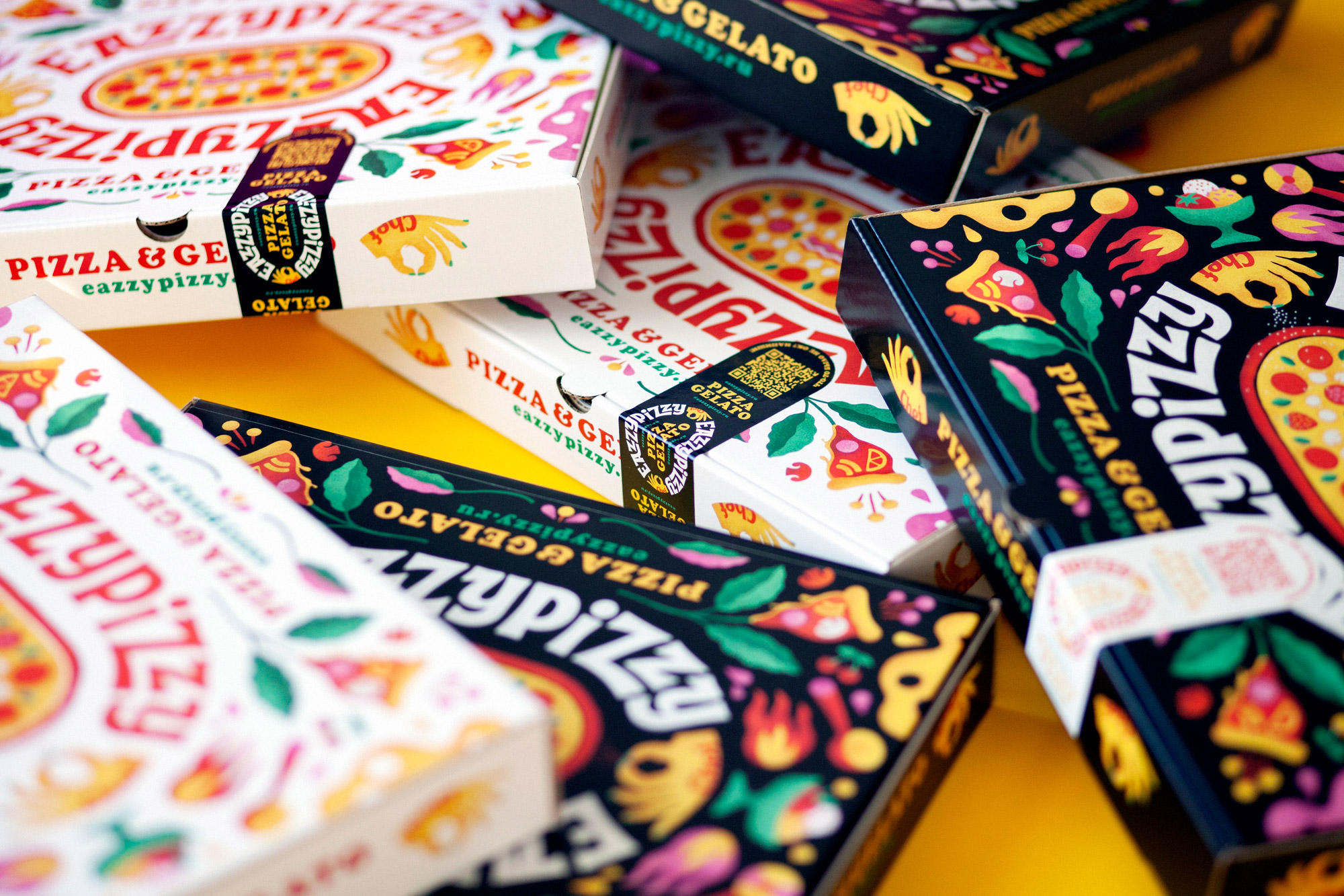
Pizza packaging represents a crucial medium of communication between the customer and the brand. In an industry where standard packaging often features dull colors and low-quality materials, it was imperative to design packaging that is visually appealing and vibrant. The branded pattern's slightly haphazard, brightly colored, chaotic graphics, along with mouth-watering colors, contrasting elements, texture use, and color noise in the illustrations, create the effect of a culinary explosion, arousing appetite and enticing taste. We've designed two packaging options: a vivid black for everyday use and a sleek white for special occasions and holidays. The brand's identity is further enriched with delightful details like various stickers and postcards.
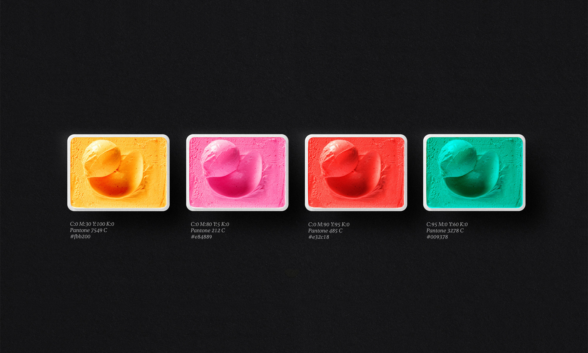
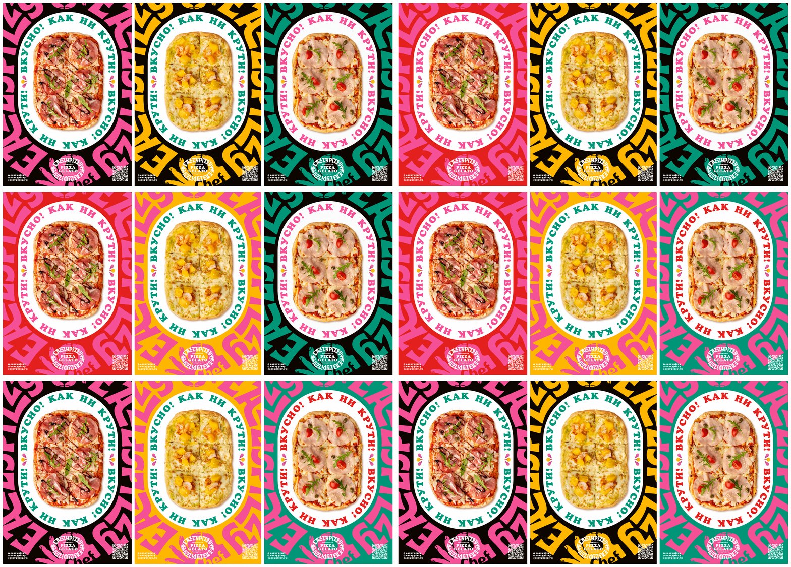
The color palette comprises four striking colors (pink, red, yellow, and green) set against a black and white backdrop, with digital noise on the colored elements of the illustrations lending a handcrafted feel to the identity. For promotional materials on social media and in communications, we chose the Cooper font for its appealing rounded shapes, warmth, and friendliness, which harmonize with the overall Eazzy Pizzy brand style.
Client: Jeti Aspan
The W Team: Eugene Wysota, Lesha Limonov
Discipline: Brand Identity, Packaging Design
Sector: Hospitality, Retail
2021
