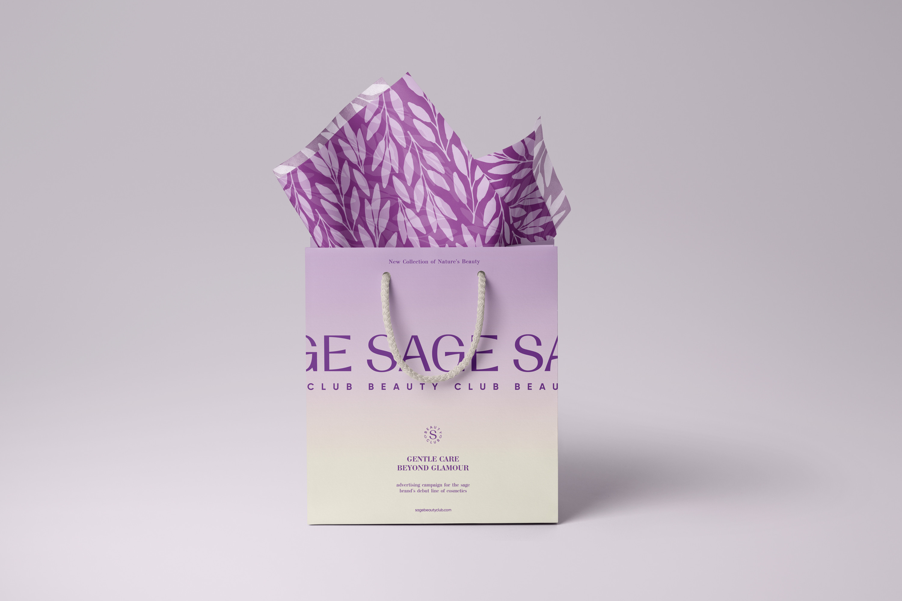
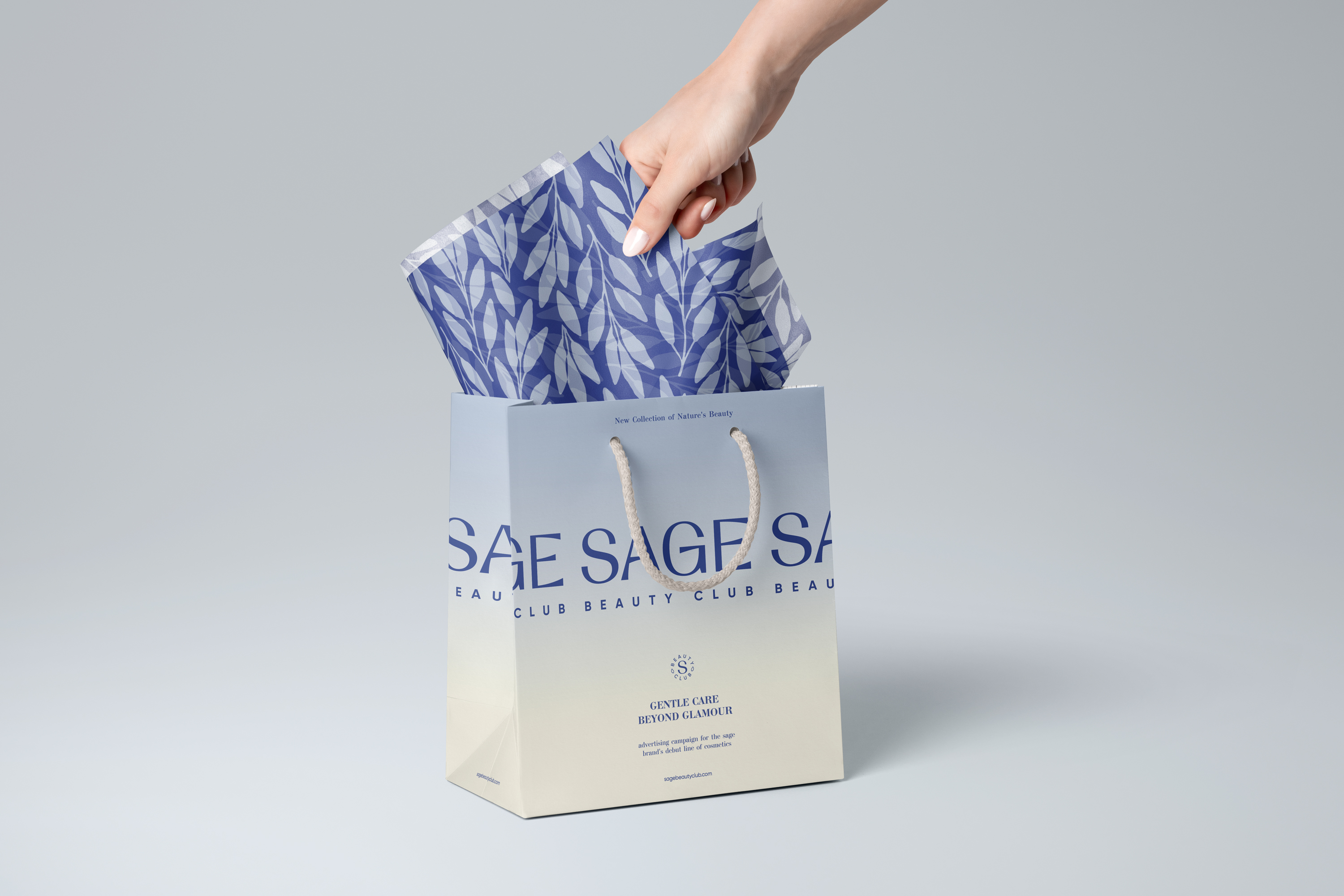
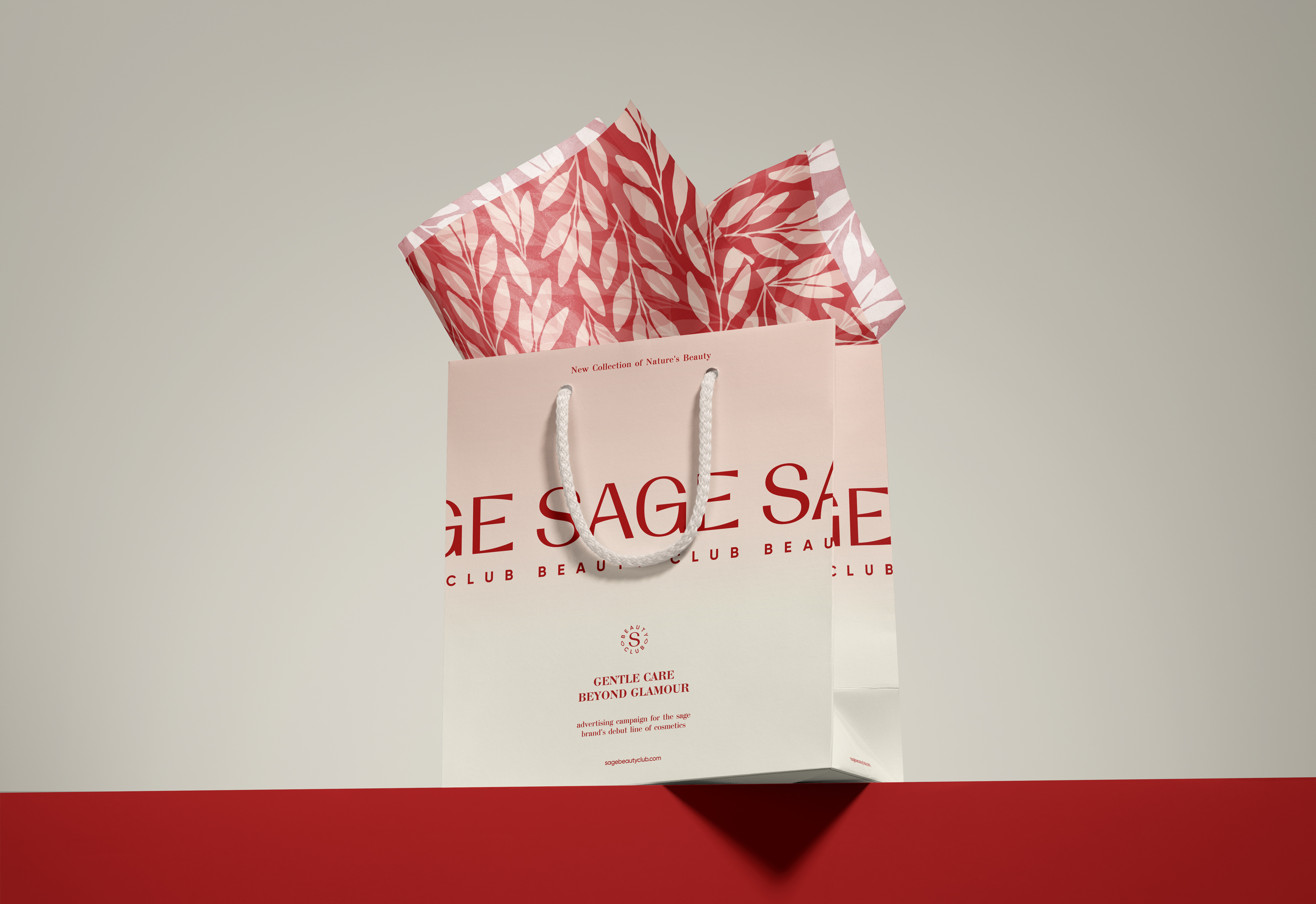
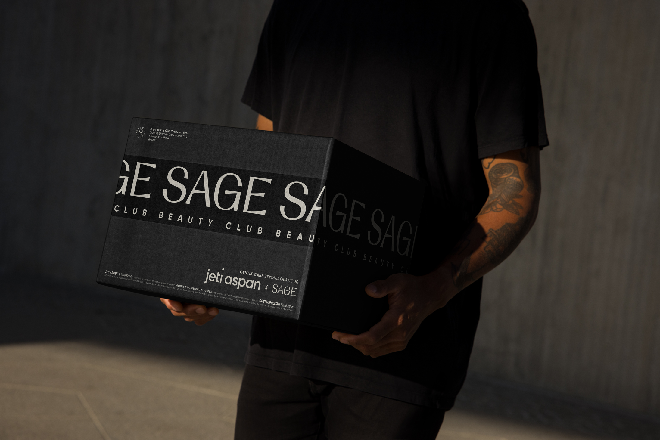
Sage Beauty Club
About
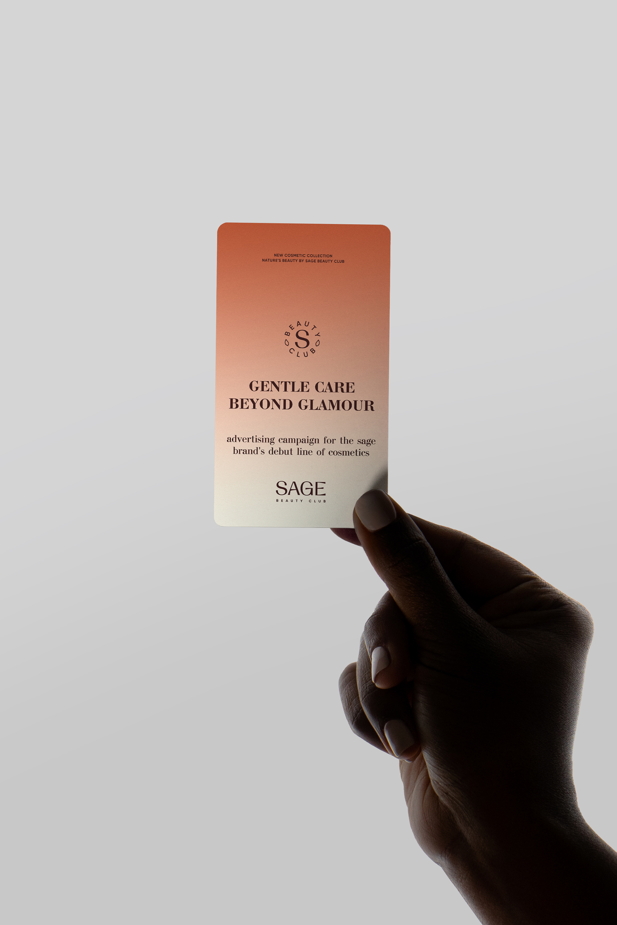
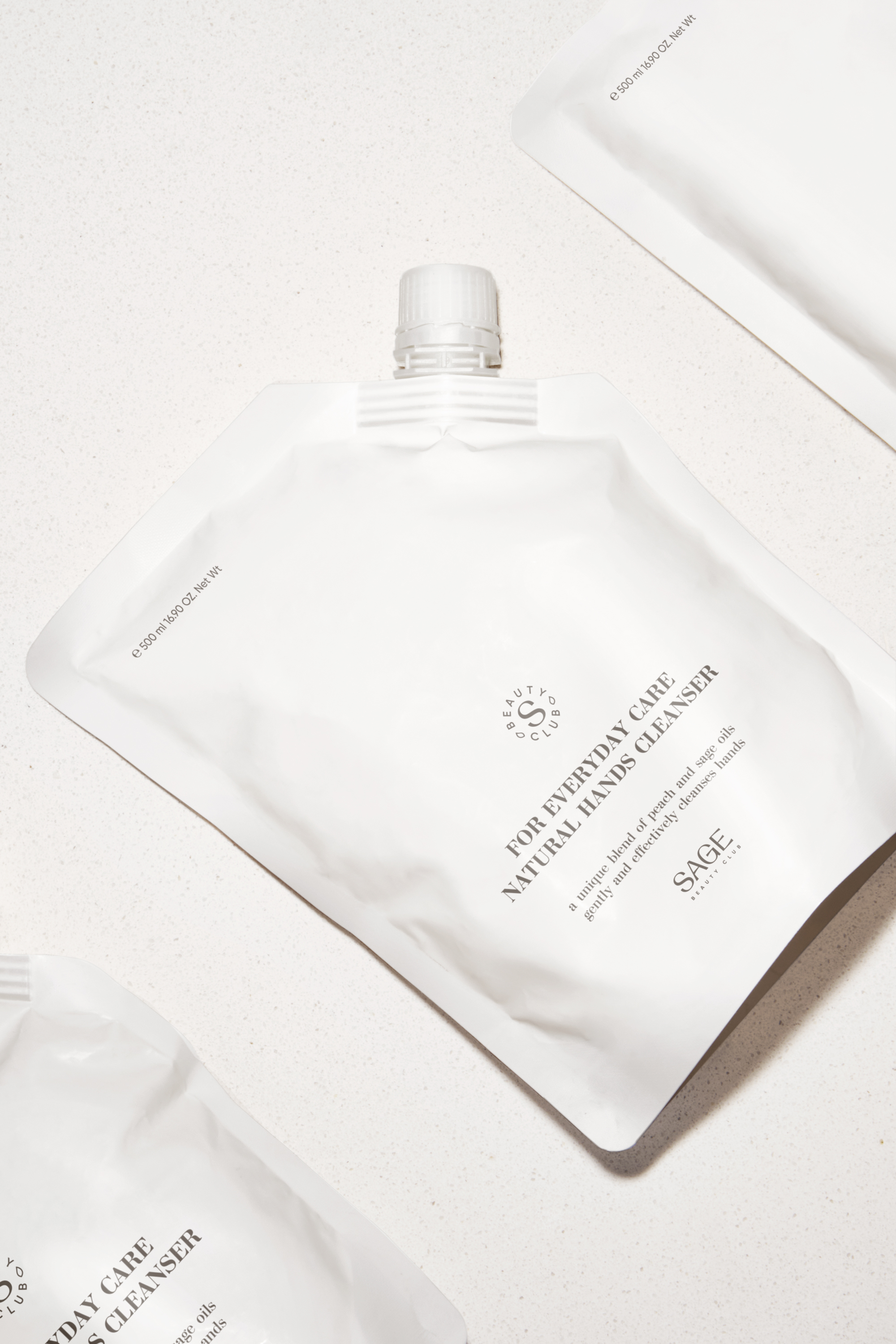
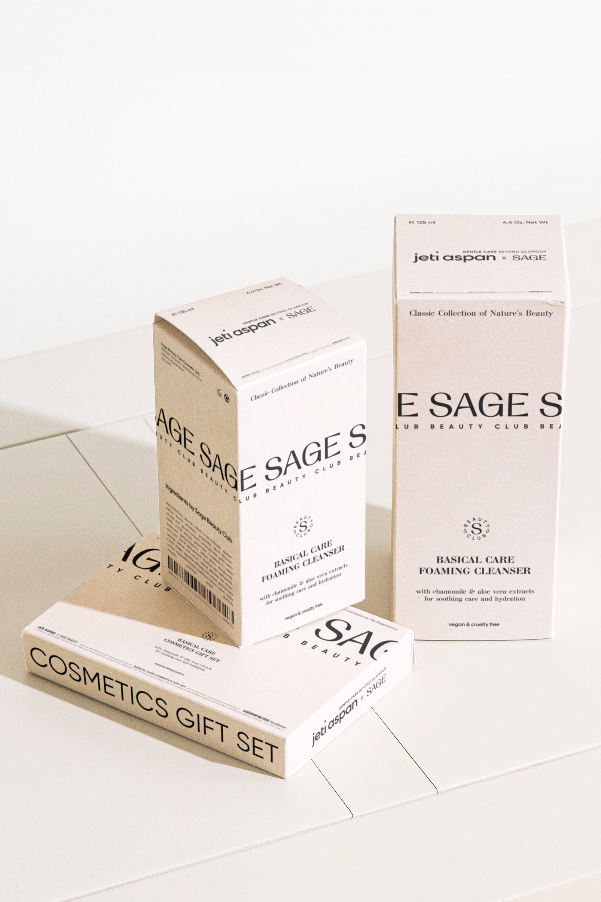
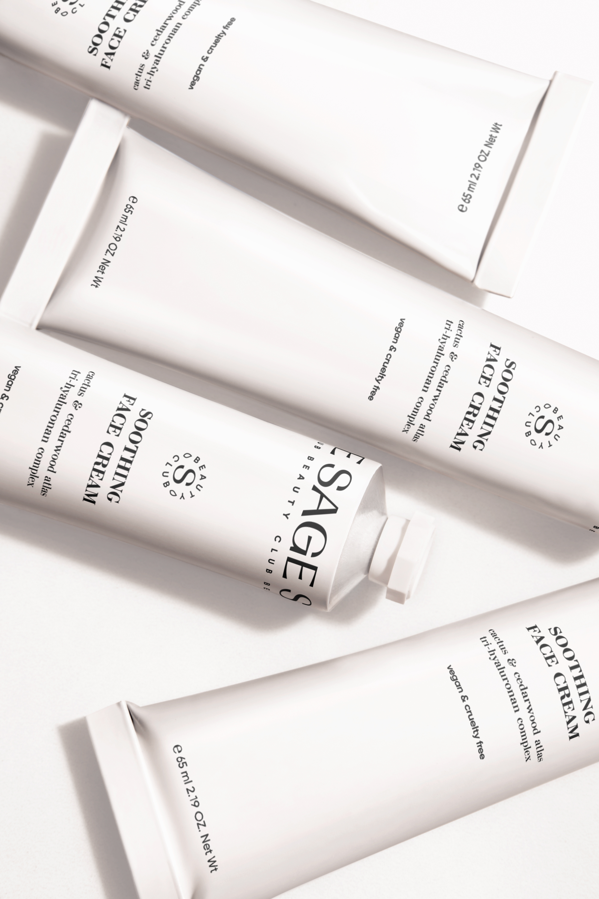
In developing the Sage Beauty Club brand, we aimed to rethink the essence of the cosmetic industry by introducing the "Gentle Care Beyond Glamour" line. This series has become the quintessence of modern design and a deep understanding of natural beauty. Each aspect of this line was developed to create a truly positive experience for the consumer, filled with pure natural energy and presented through the language of modern visual code.
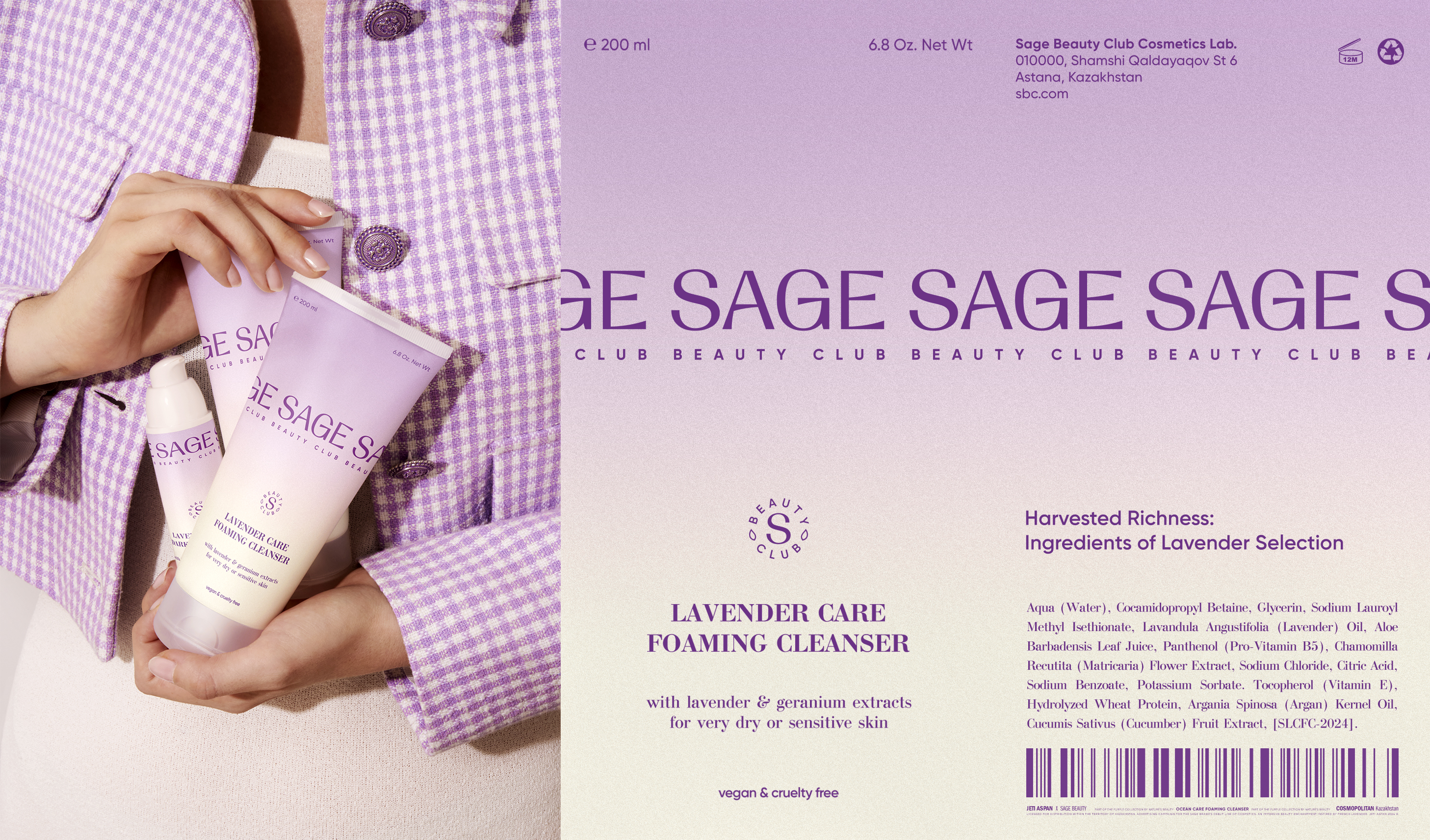
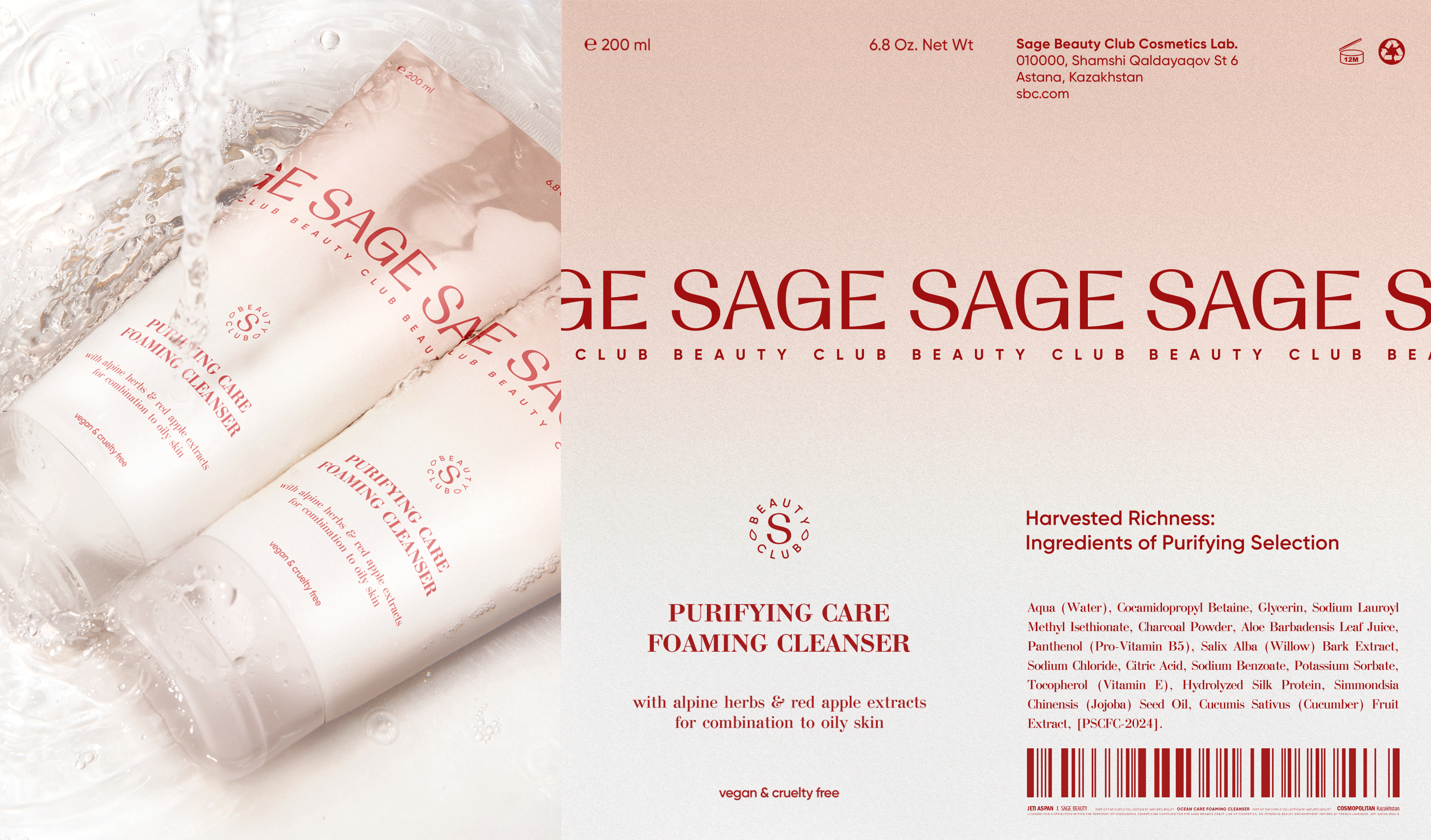
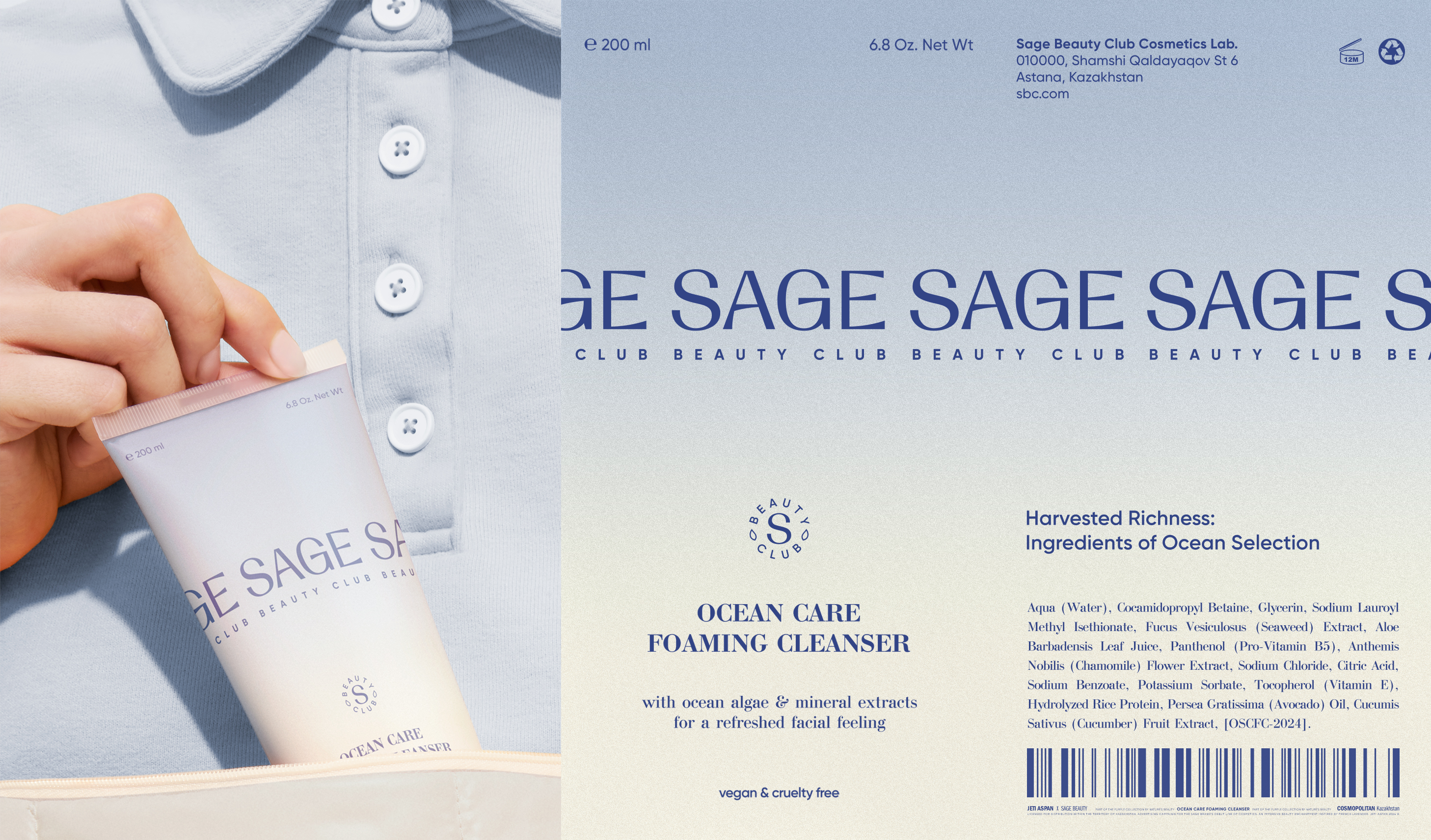
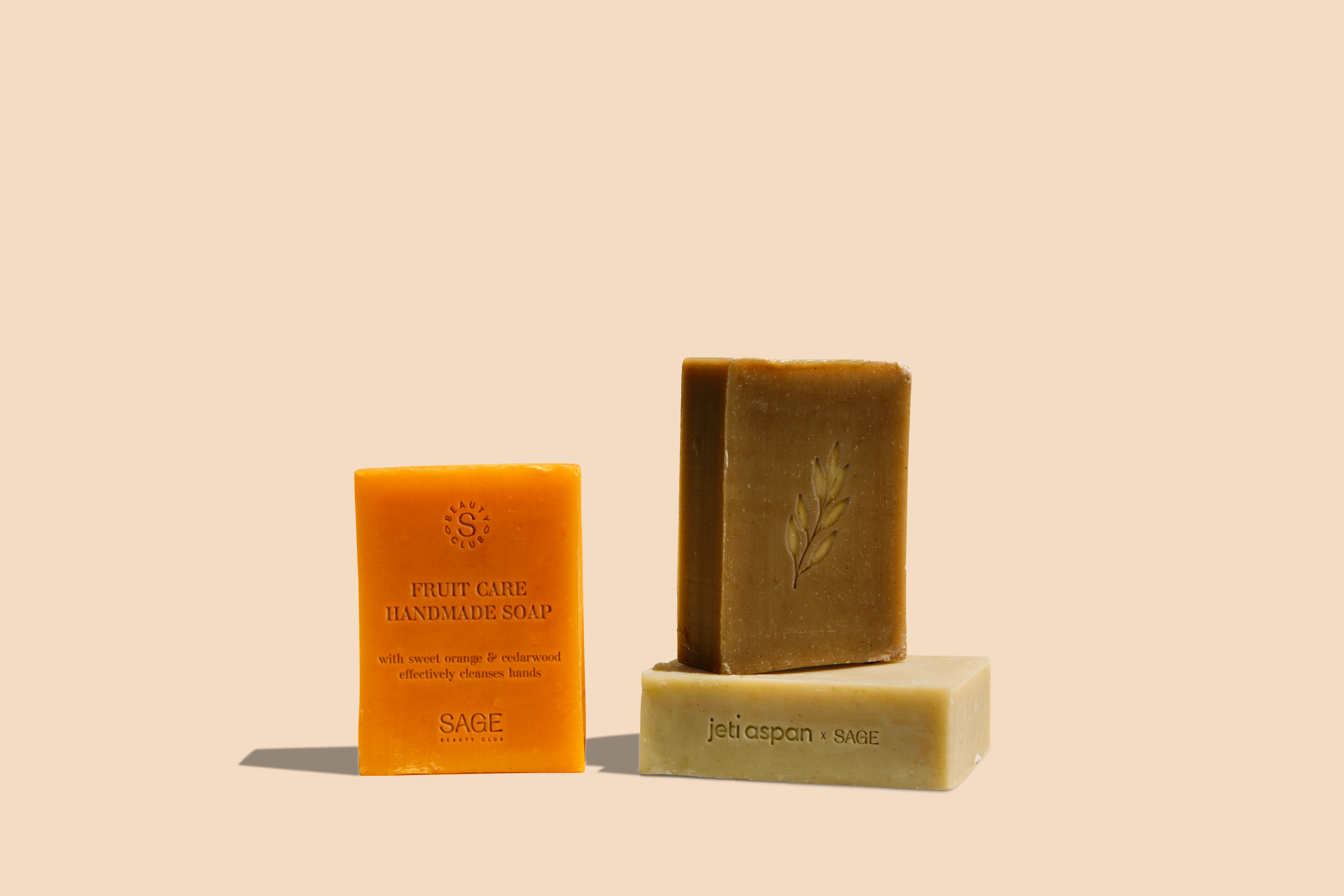
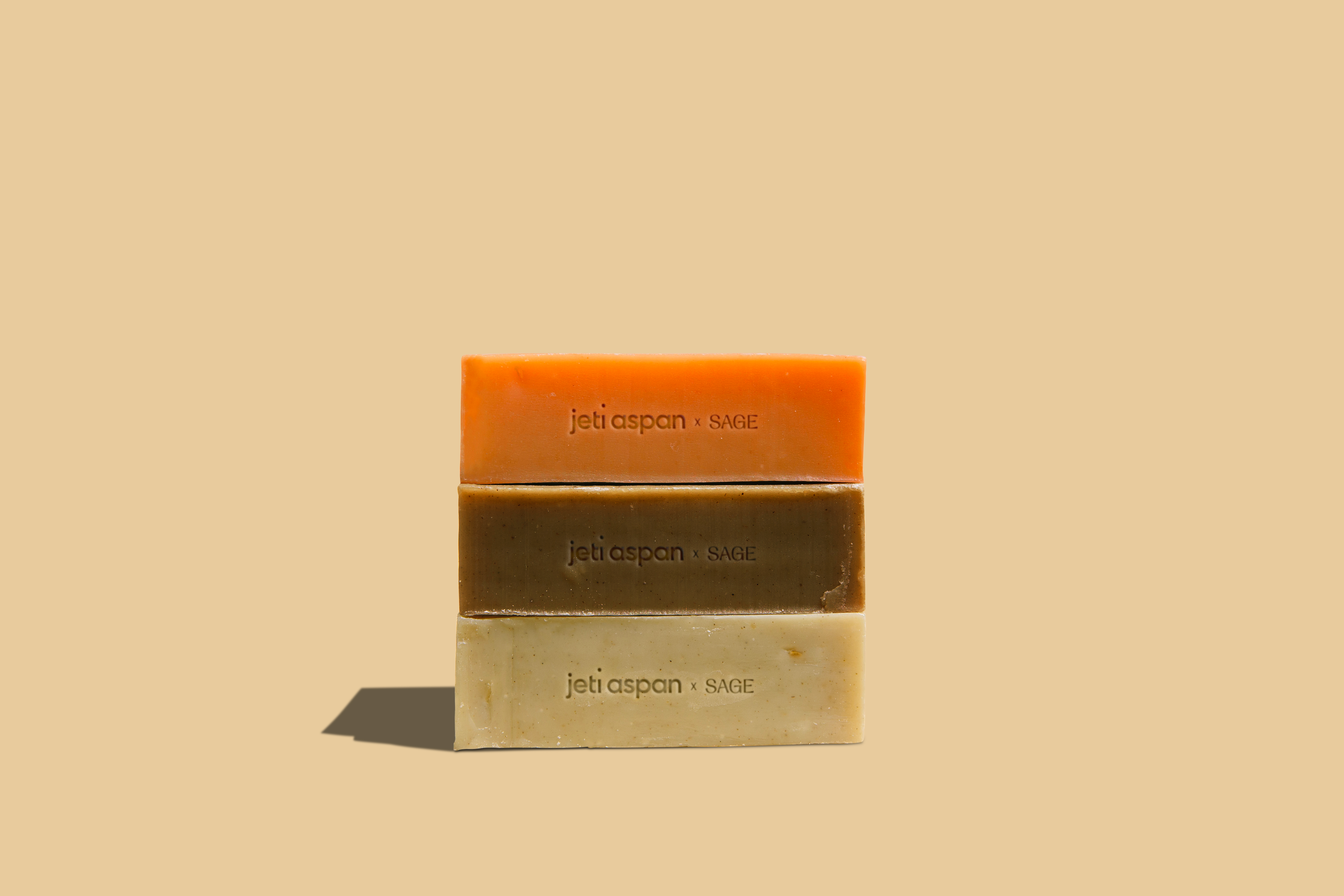
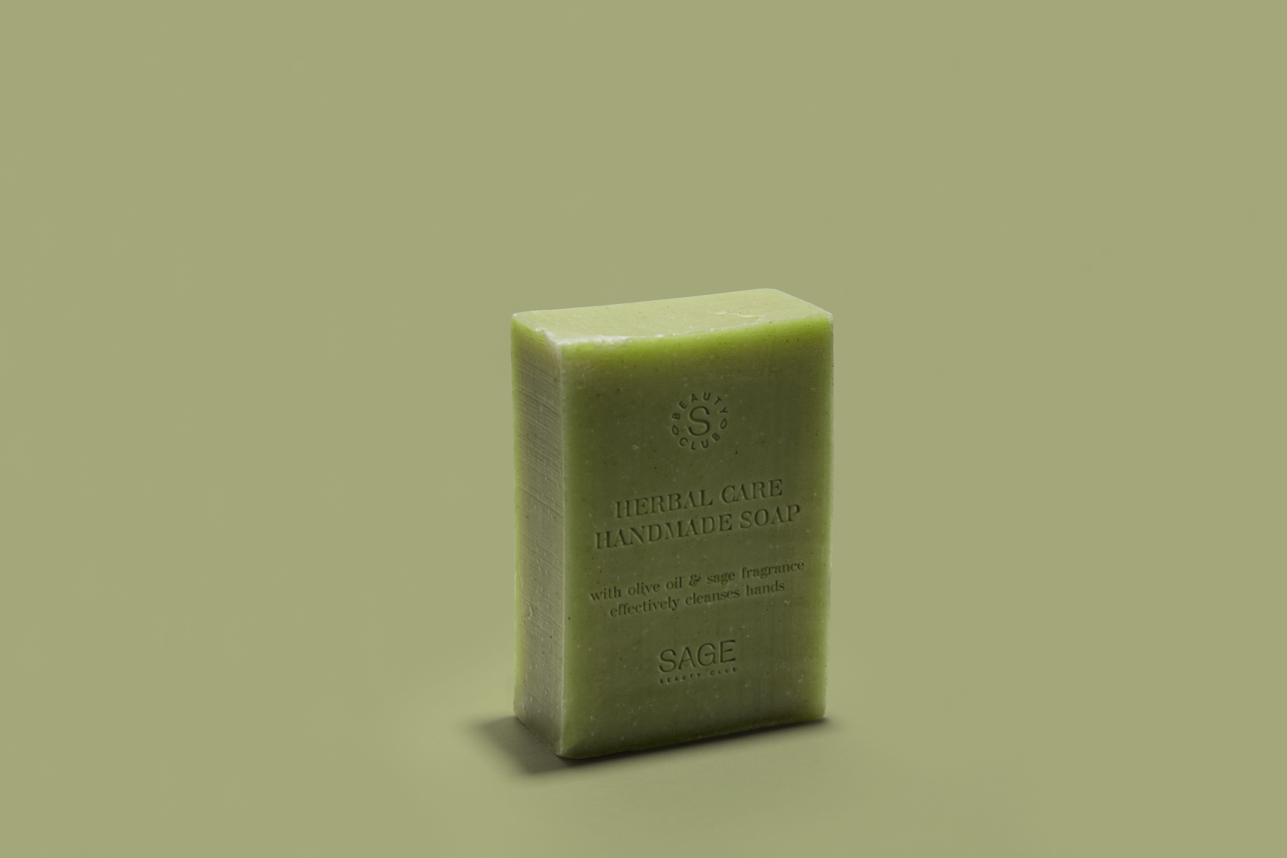
Throughout the development process, we were inspired by three main themes: the inexhaustible wealth of nature, the elegance of floral and fruity motifs, and the fundamental principles of medical cosmetics. These elements combine, creating a collection that cares for the skin and contributes to the harmony of internal and external well-being.
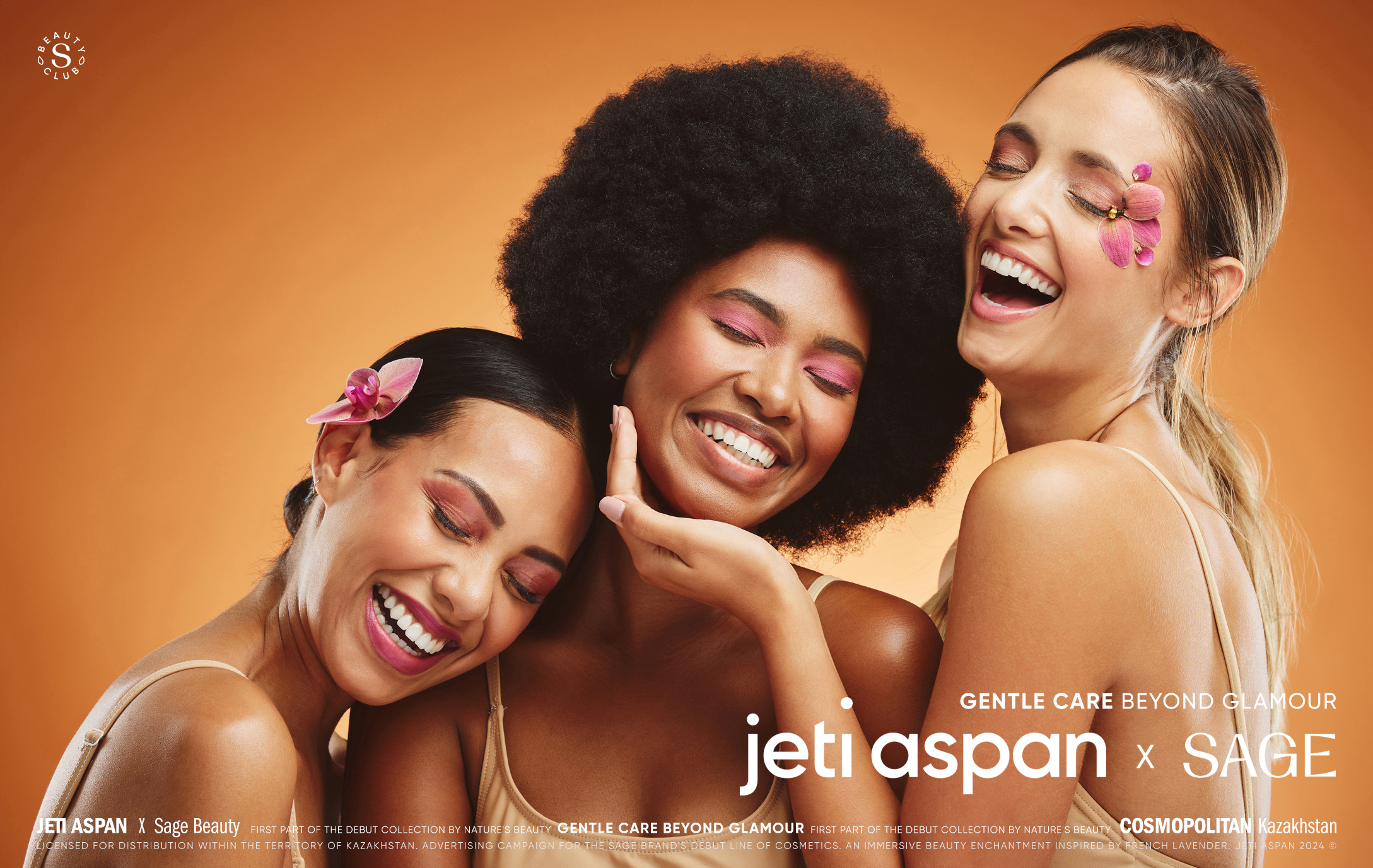
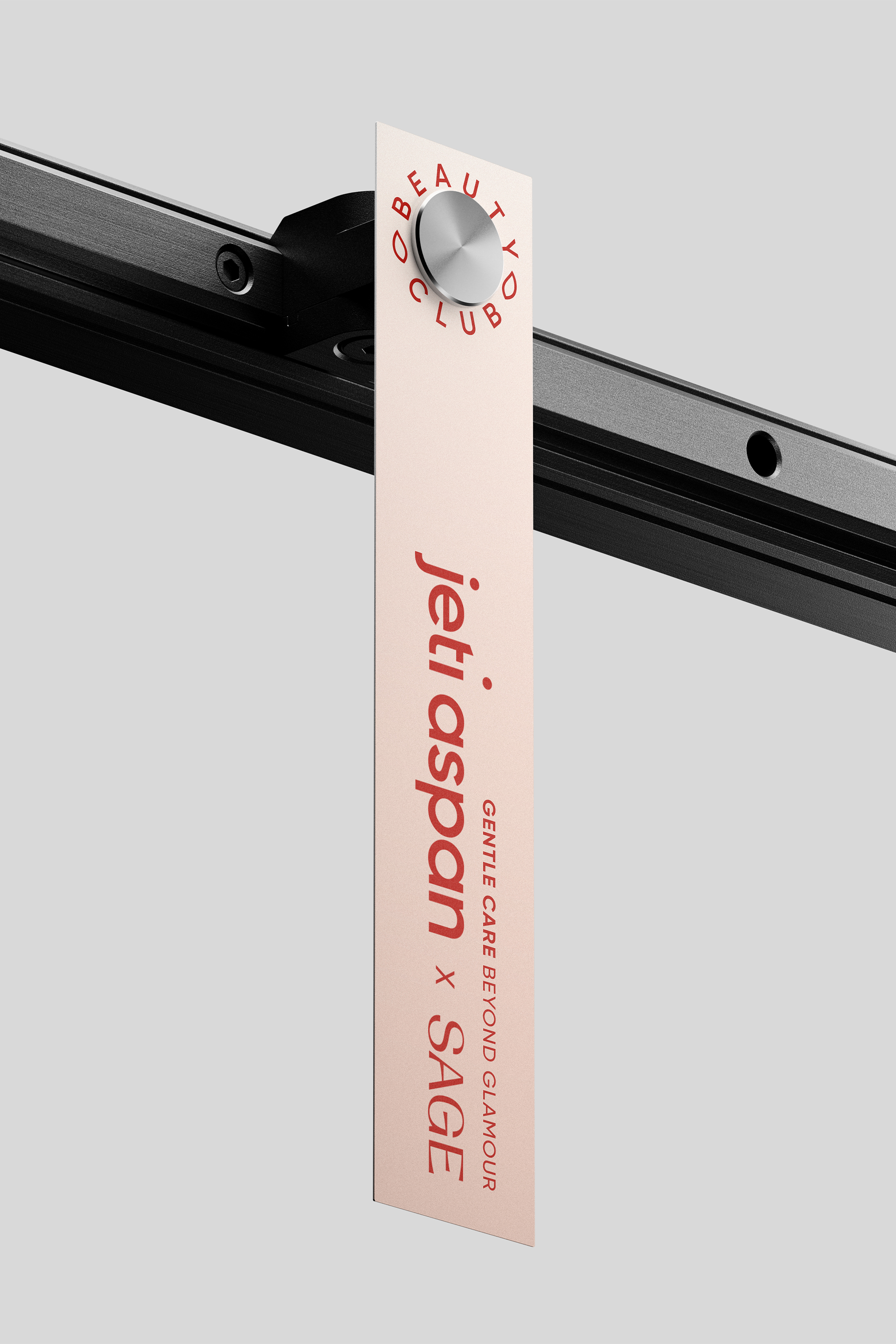
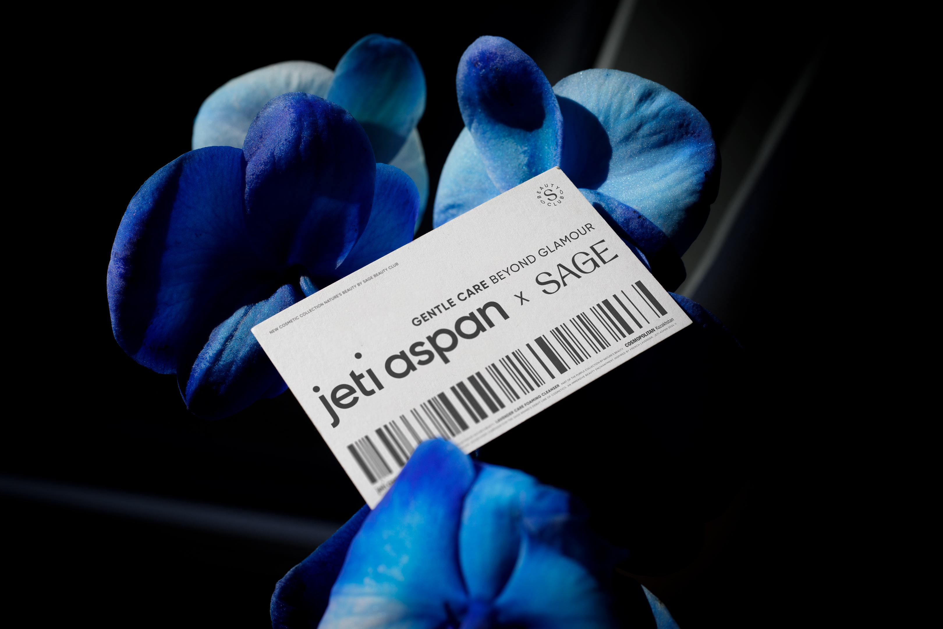
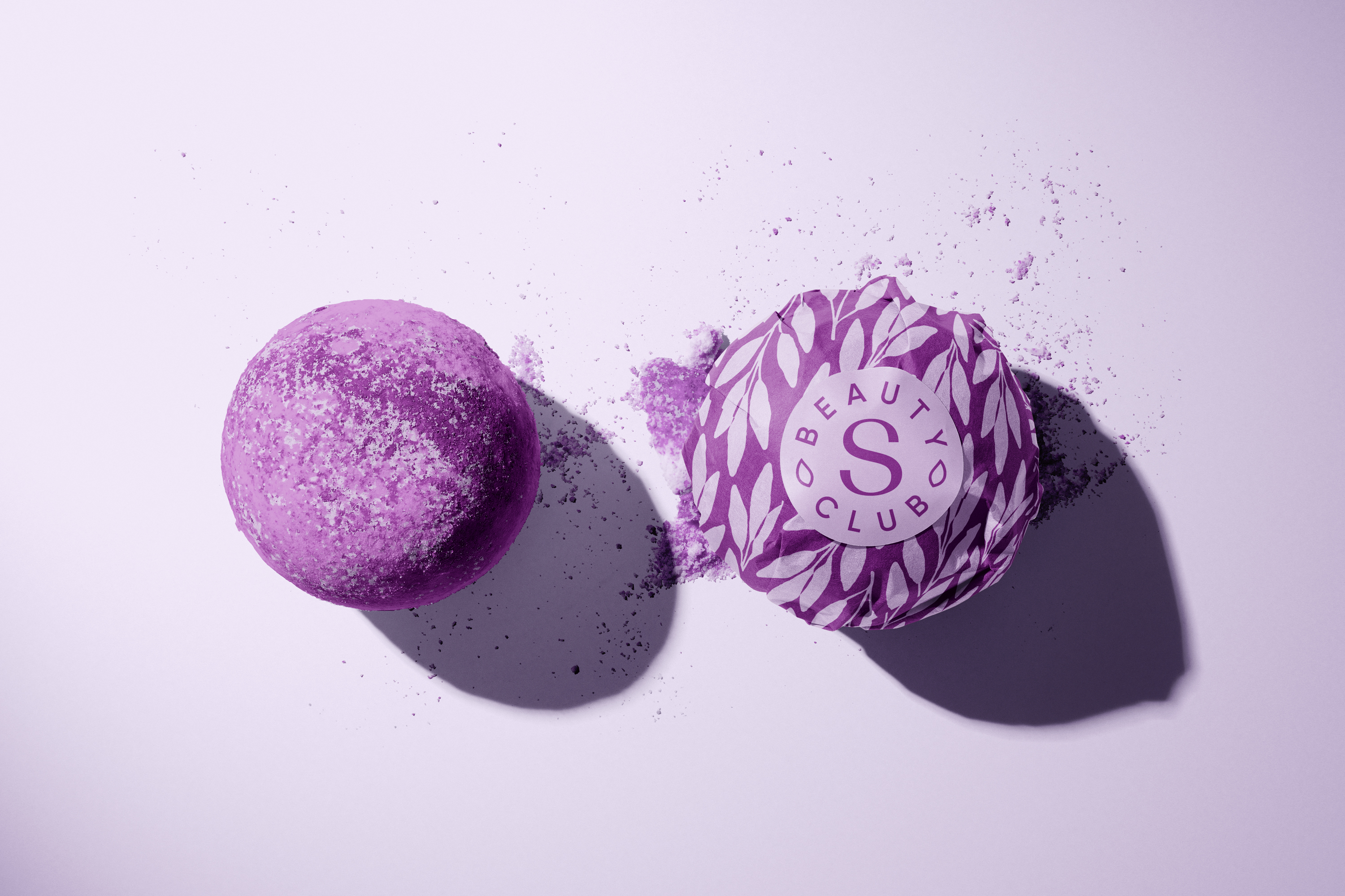
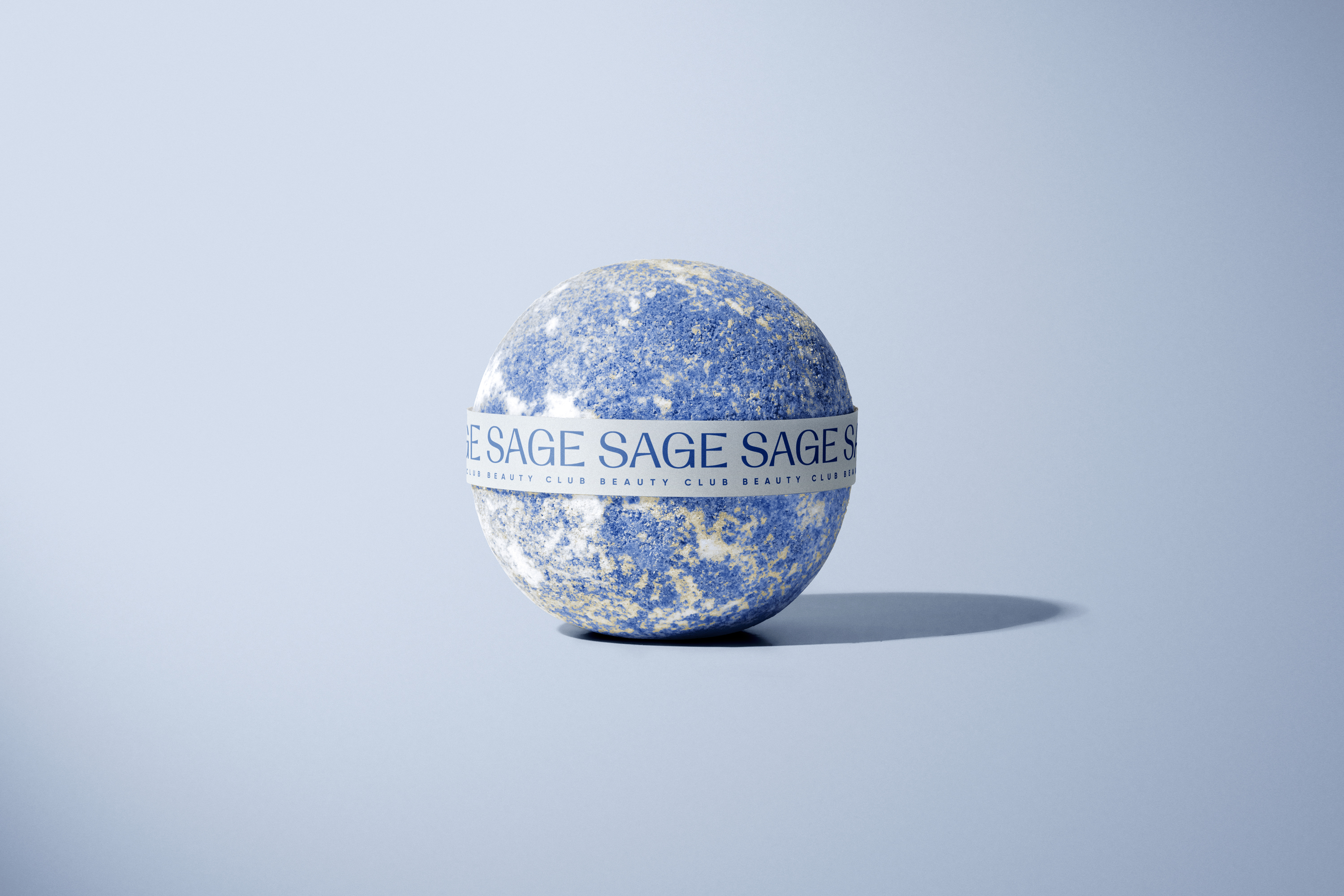
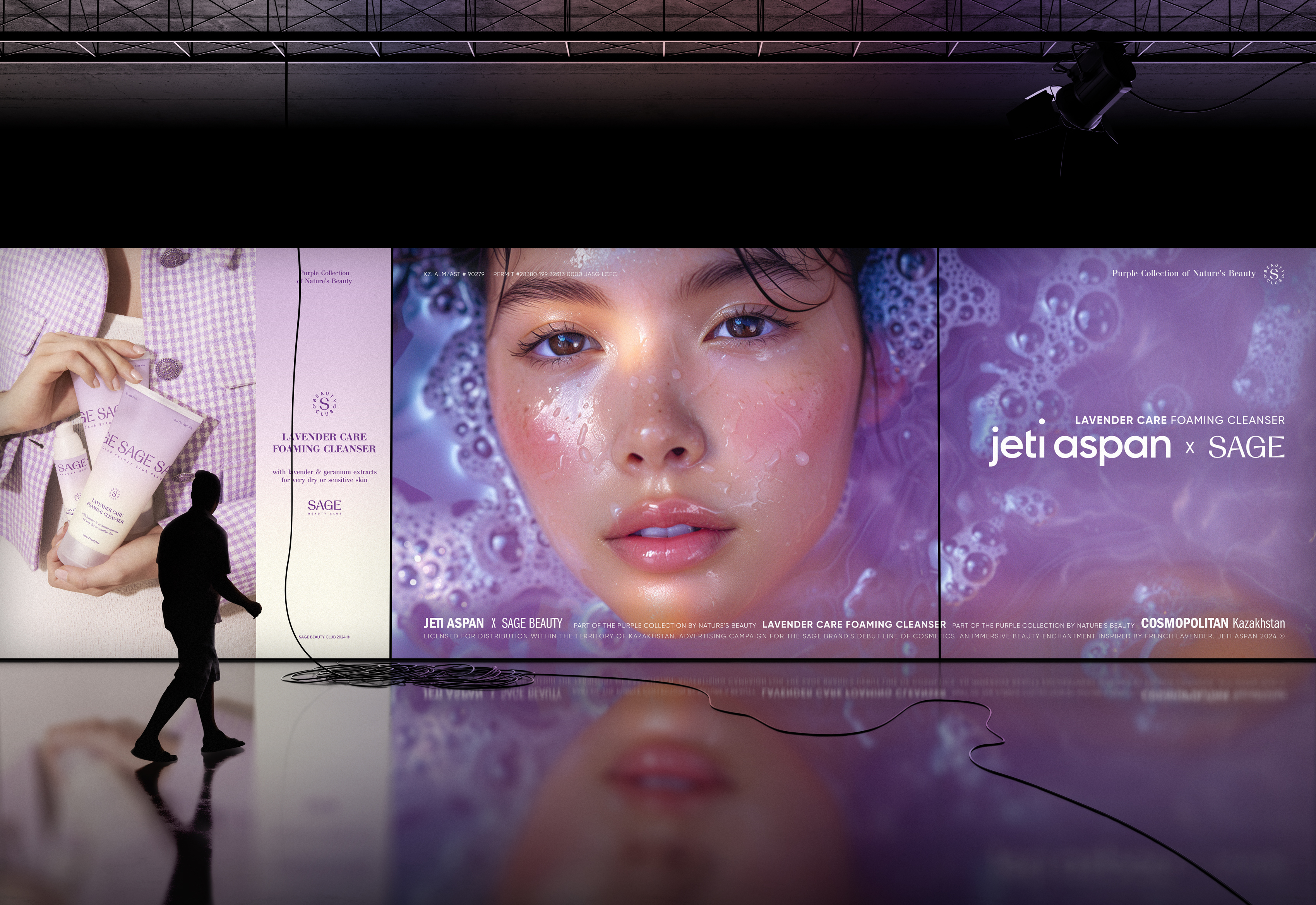
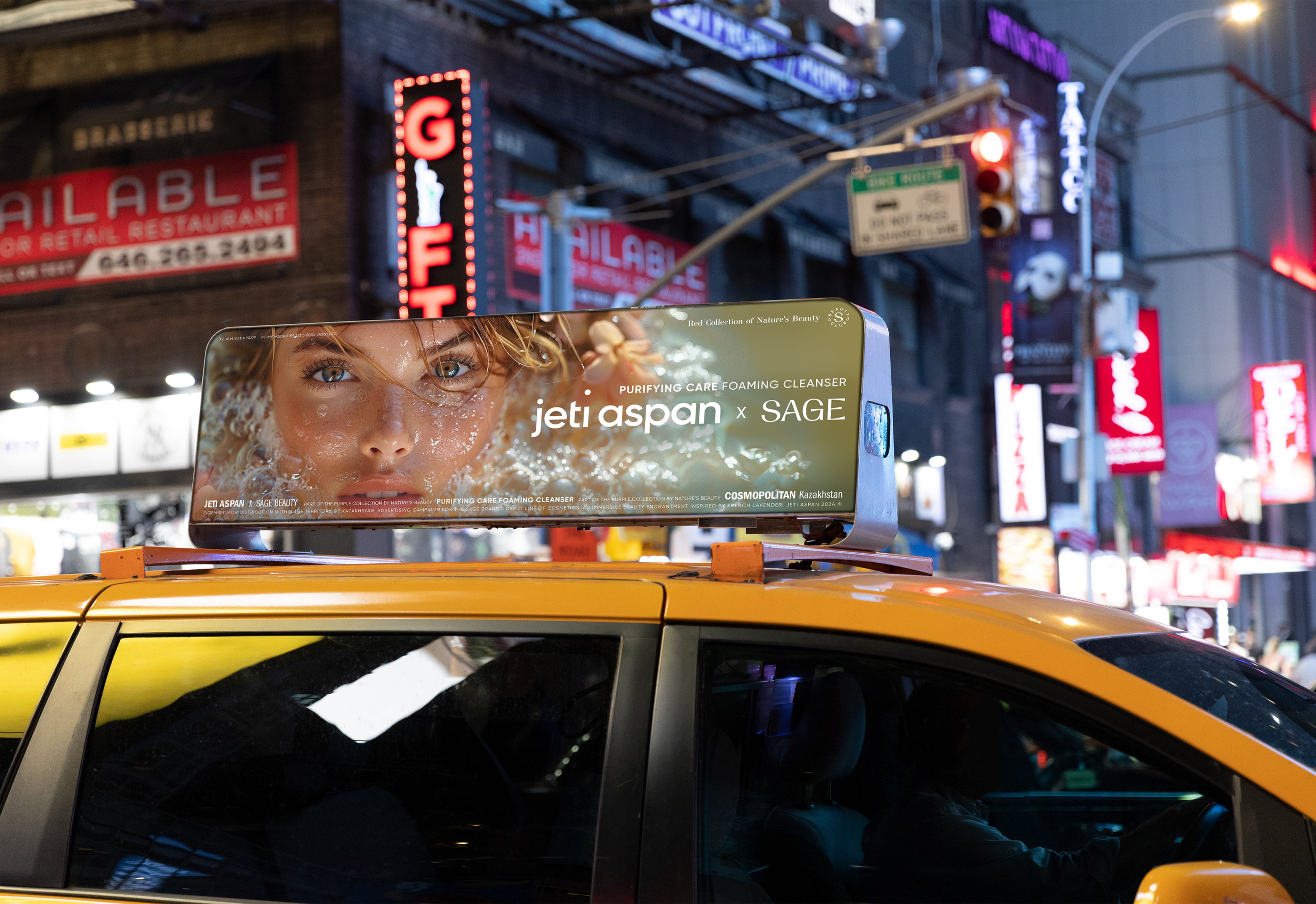
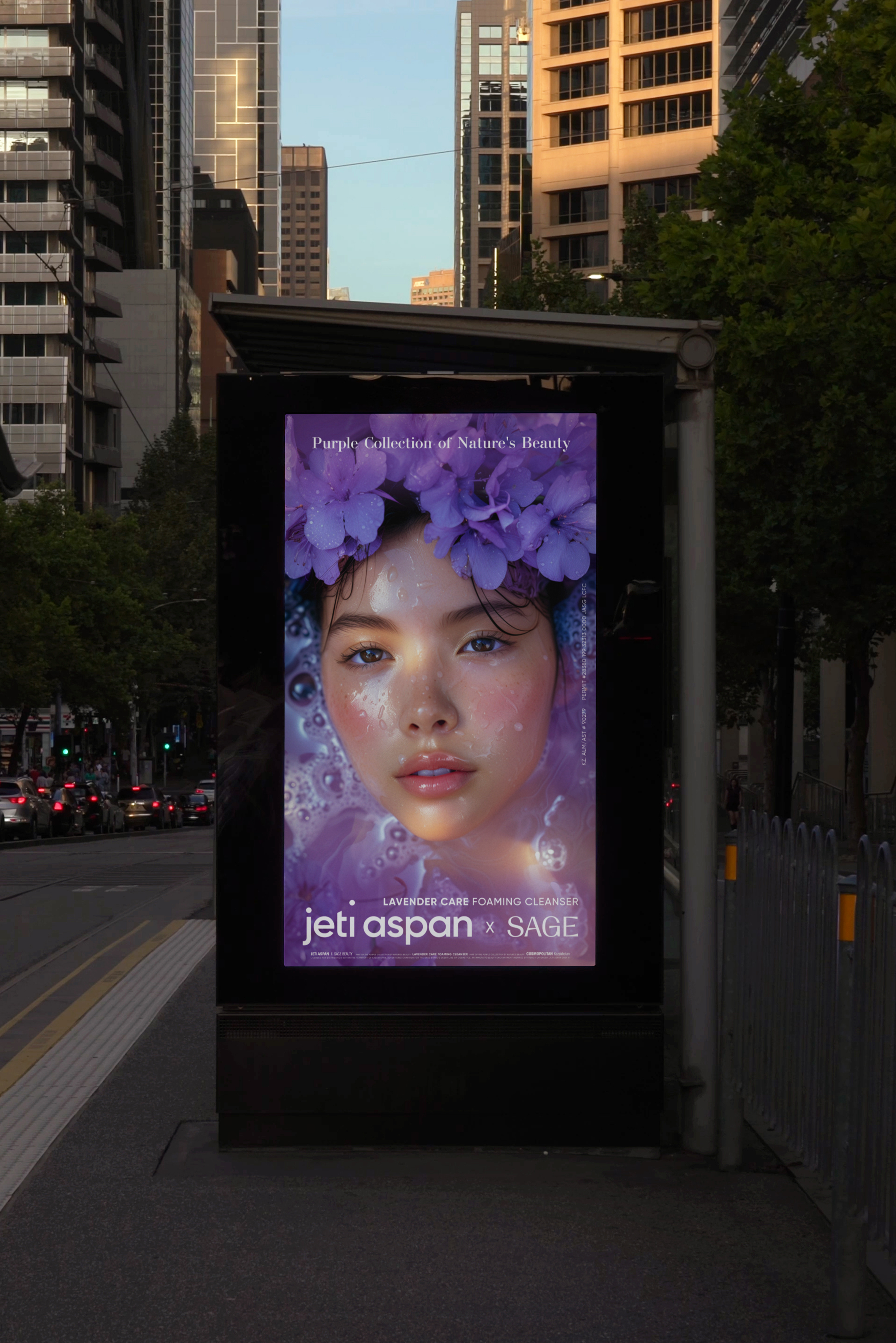
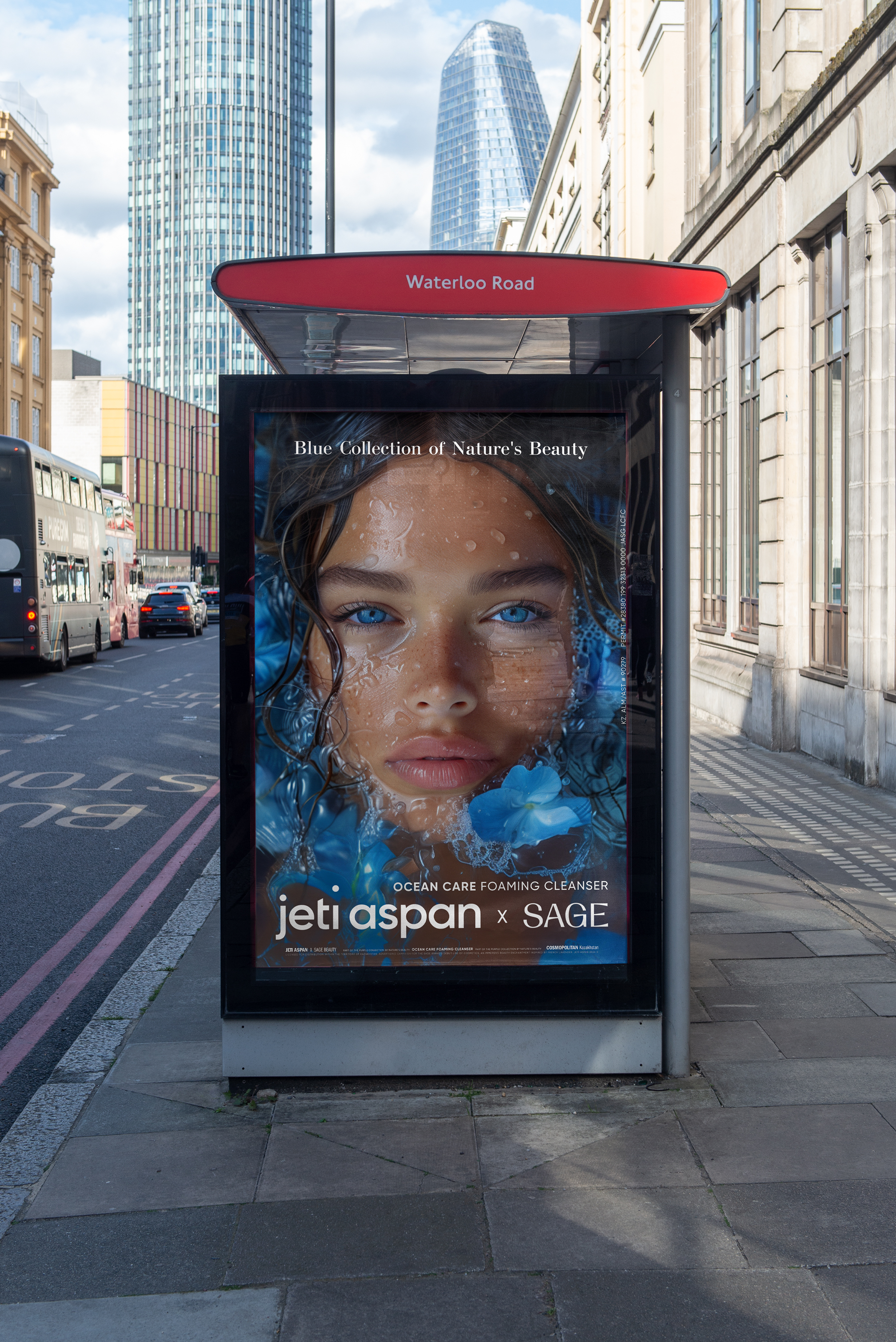
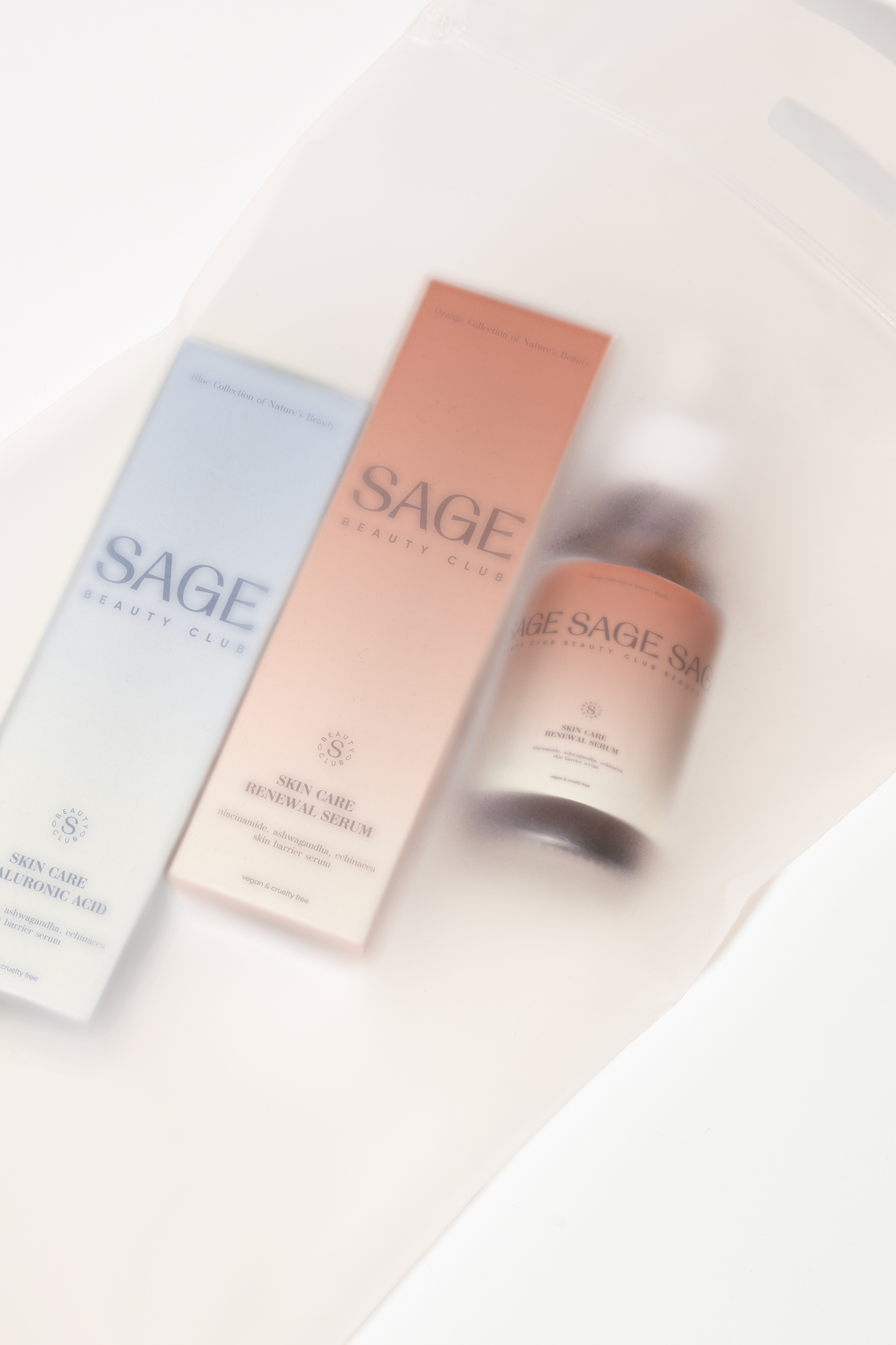
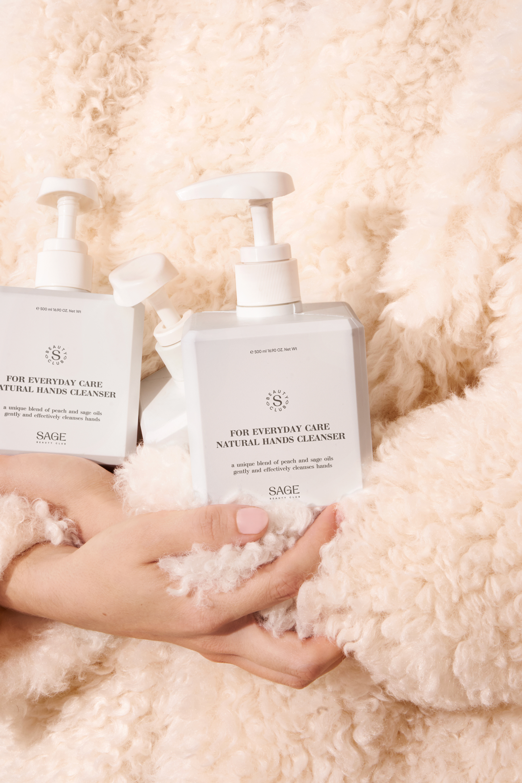
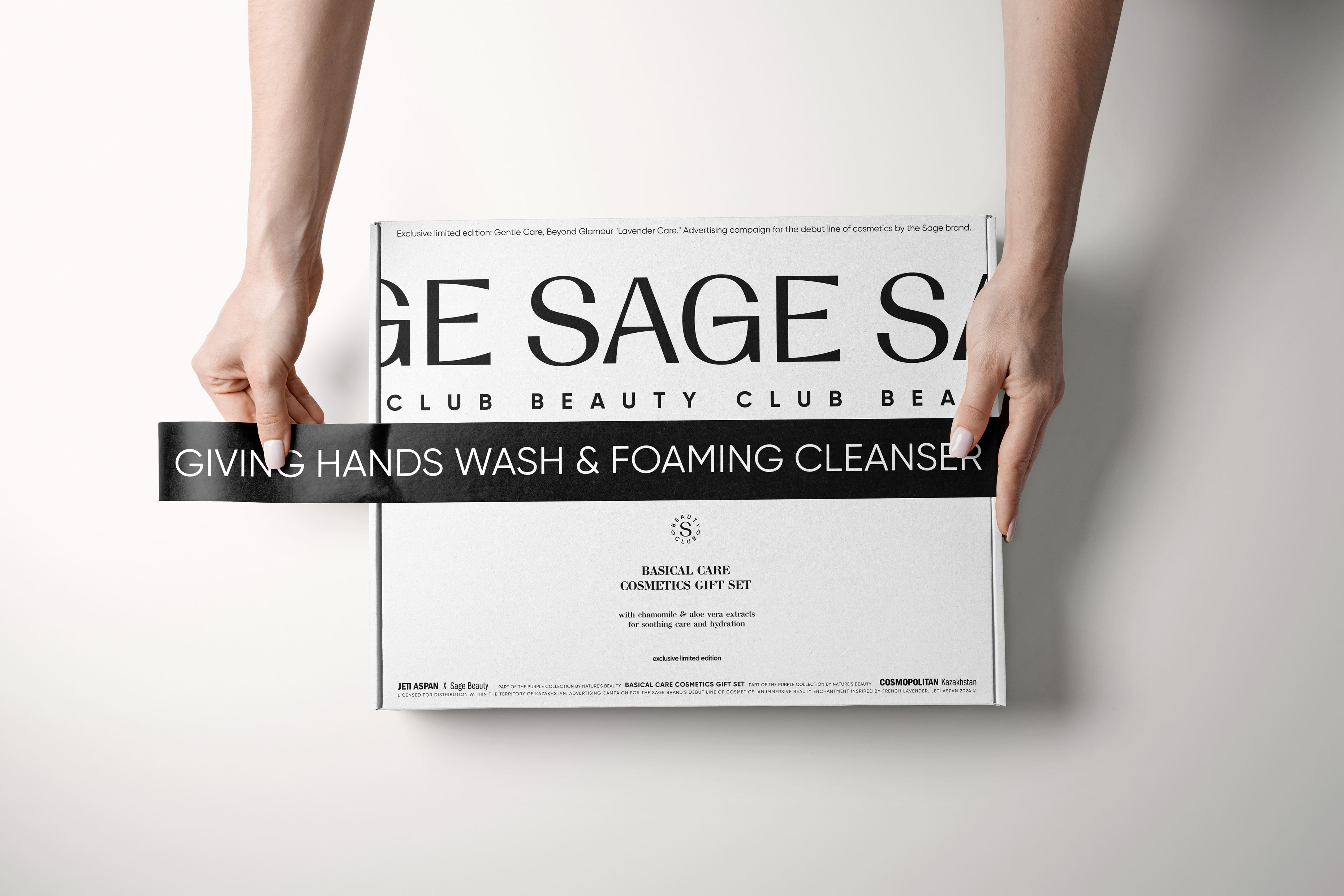
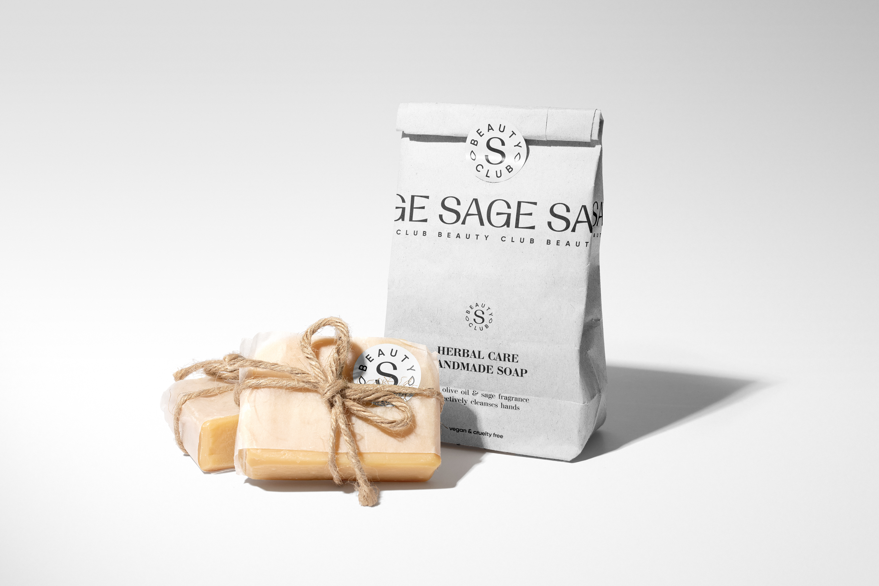
The identity of the Sage Beauty Club brand is deeply rooted in natural colors and minimalist layout design, complemented by the rhythm of a repeating logo and brand symbol. The use of gradients, inspired by the style of Jeti Aspan (translated as "the seventh heaven") – the founder of Sage, aims to draw attention to the variety of color shades associated with celestial motifs. The photoshoot concept is built around the theme of water as the basis of life and healing energy, where flowers symbolize refined natural beauty. The models' makeup emphasizes the superiority of natural beauty, focusing on true aesthetics and naturalness.
Sage Beauty Club strives not only to create cosmetics but also to form a new culture of beauty perception, where each element reflects a deep connection between humans and nature, between appearance and the inner world. We are proud to present this project, demonstrating how the harmony of design and respect for naturalness can be embodied in the creation of outstanding cosmetic products.
Sage Beauty Club invites everyone to discover beauty that requires no compromises between efficacy and aesthetics, between science and art. Together, we are rethinking the canons of beauty, offering the world a new standard – beauty based on care, respect, and love for oneself.
Client: Jeti Aspan
The W Team: Eugene Wysota, Helen Trophimova, Lesha Limonov
Discipline: Brand Identity, Layout Design, Packaging Design
Sector: Retail
2021